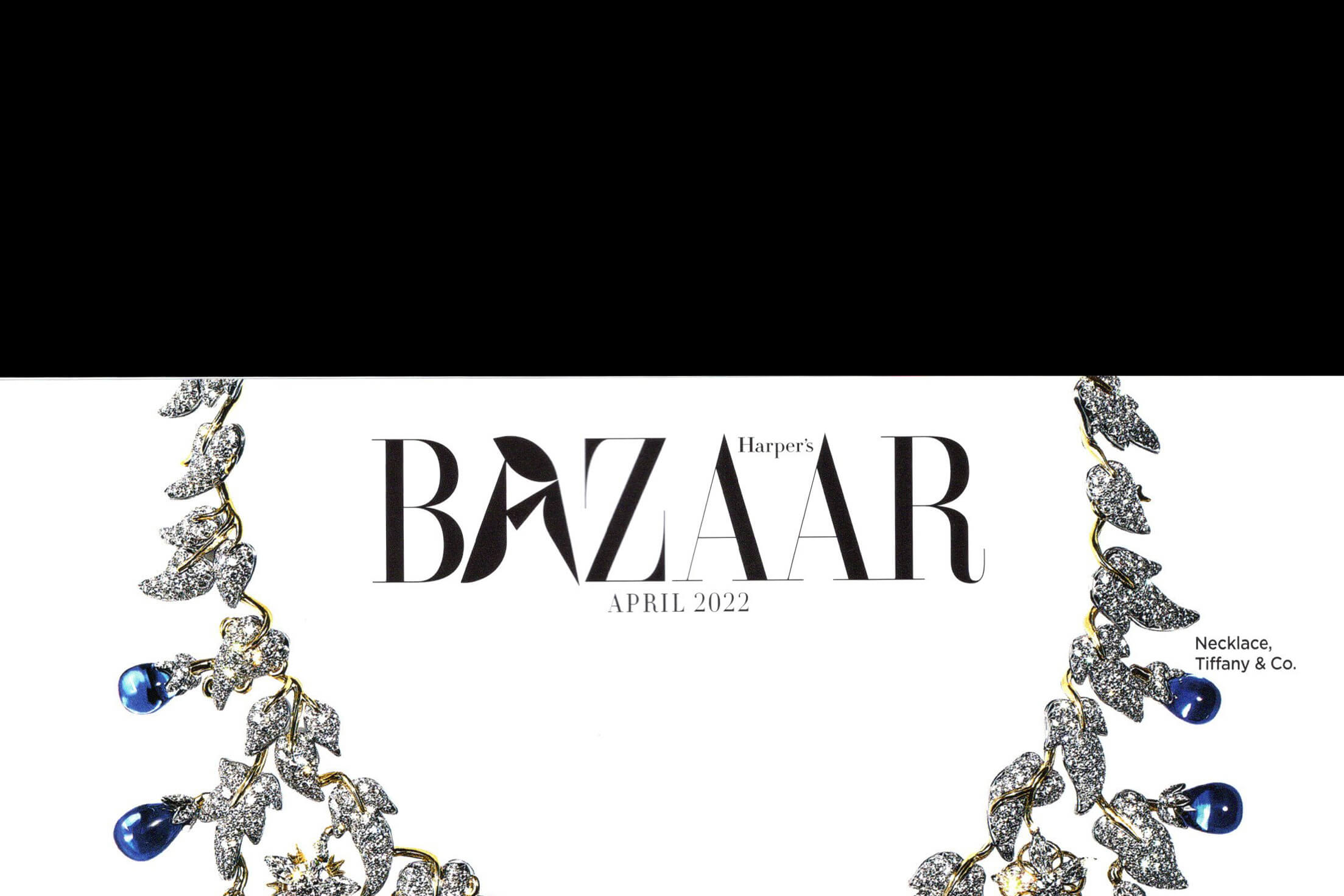
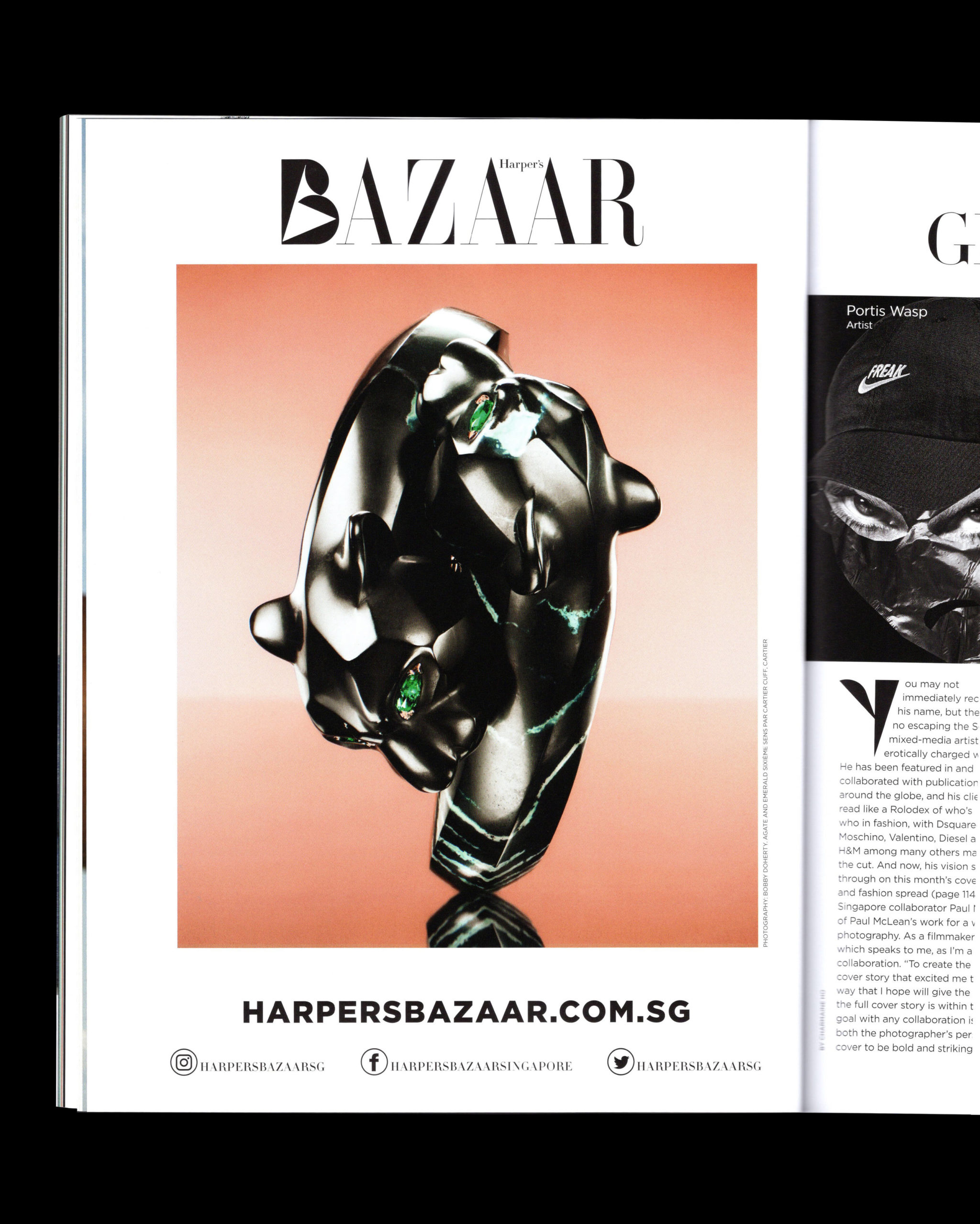
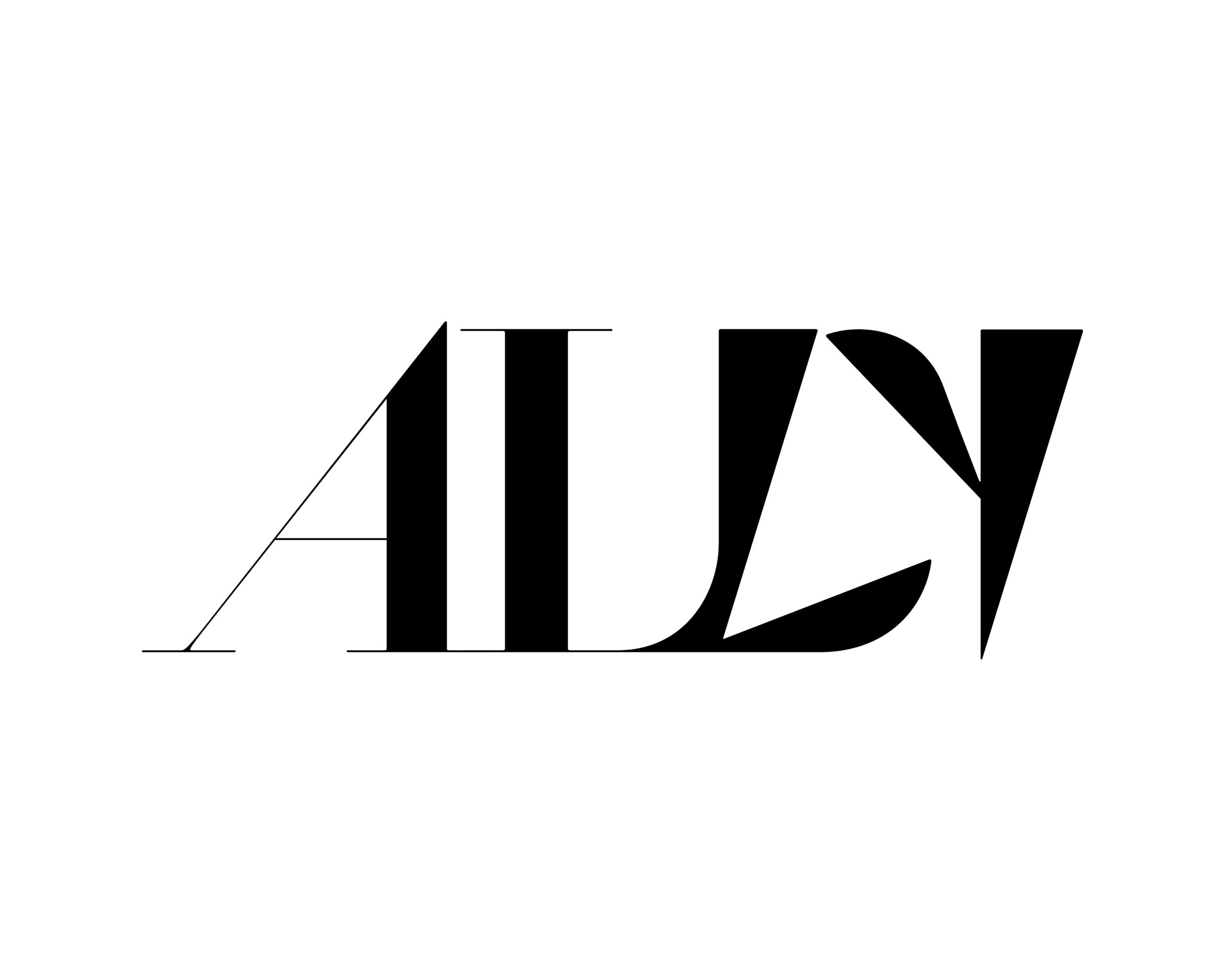
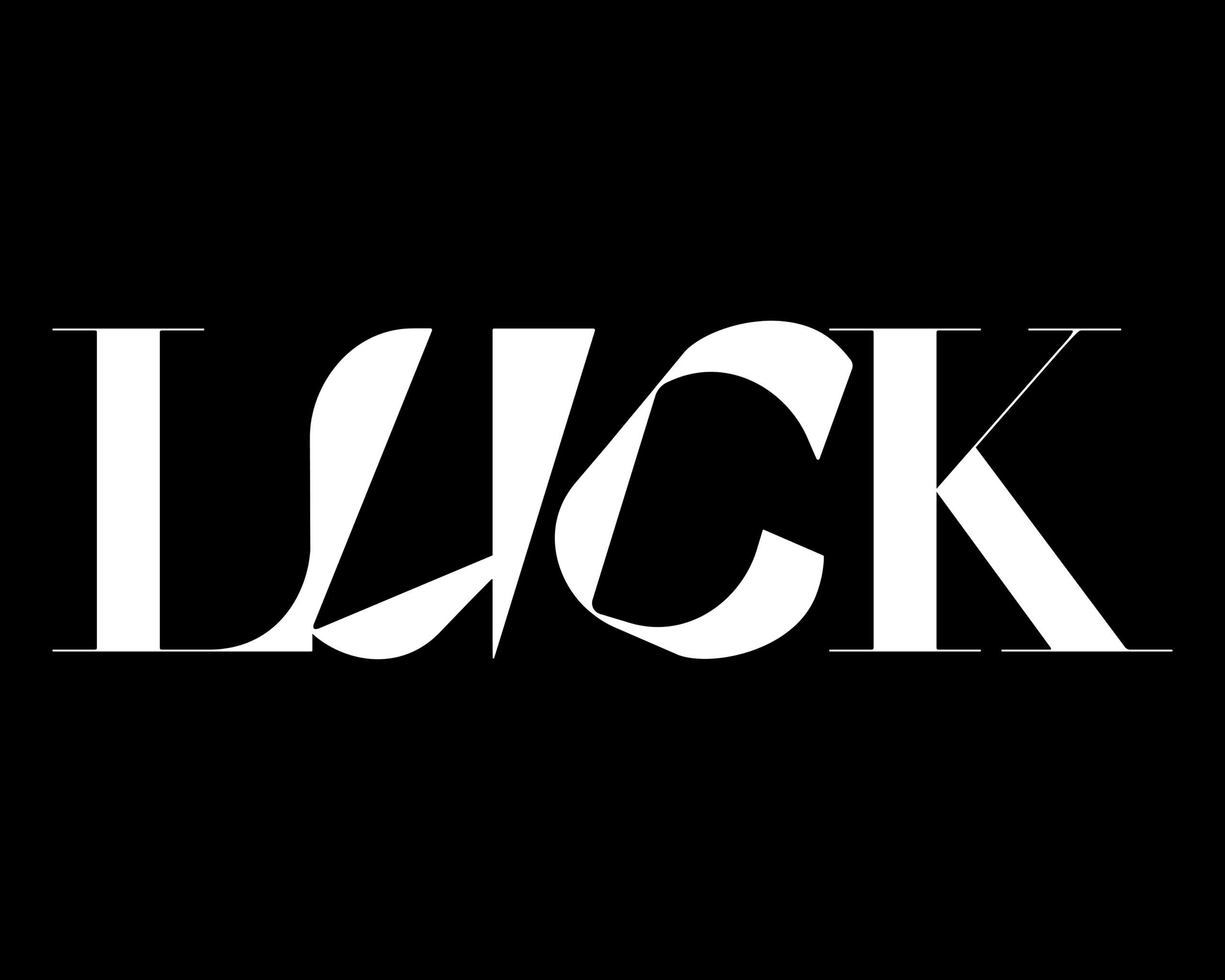
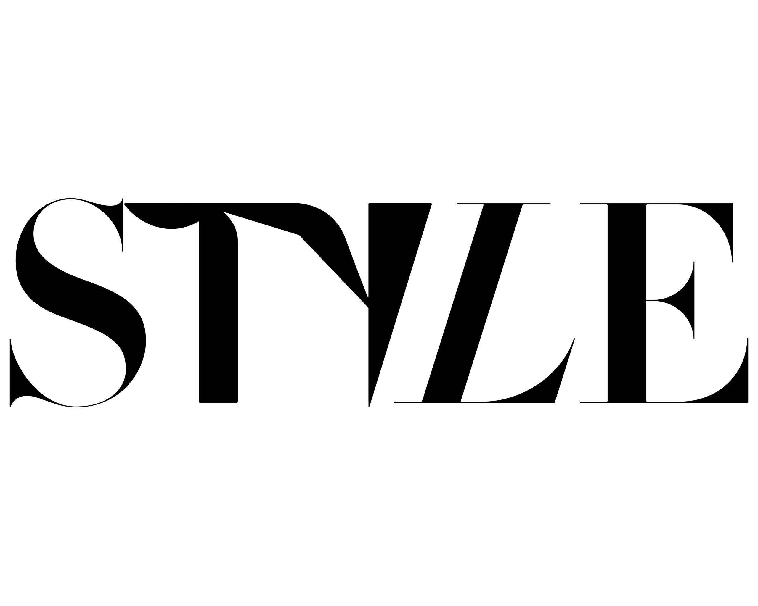
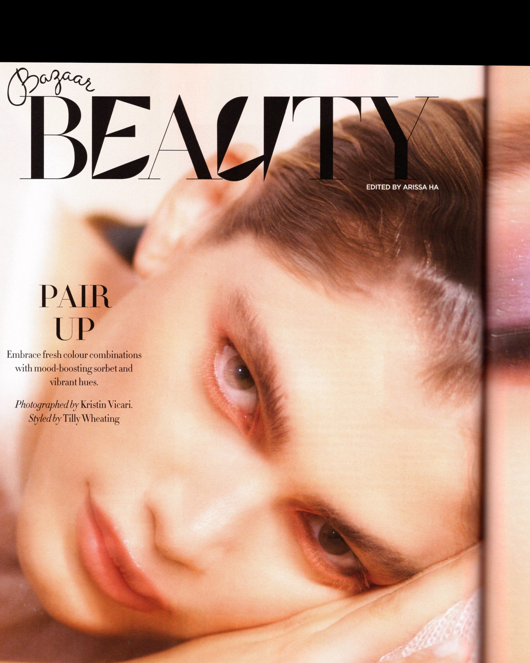
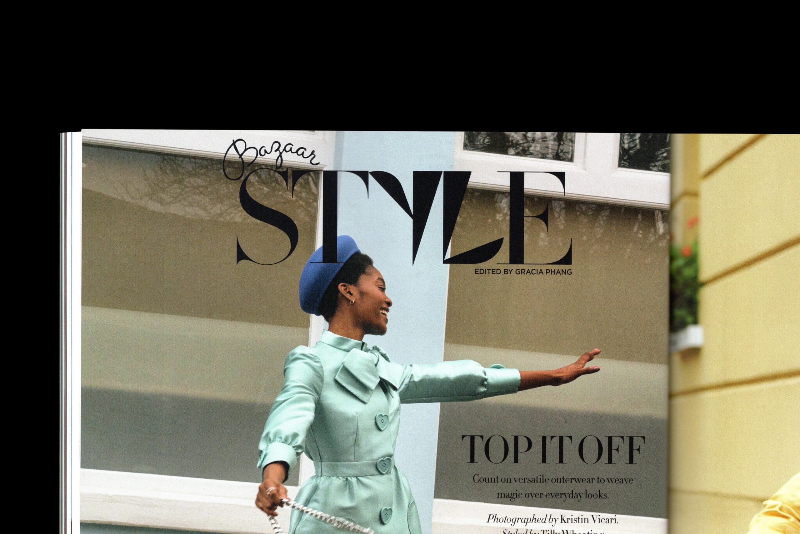
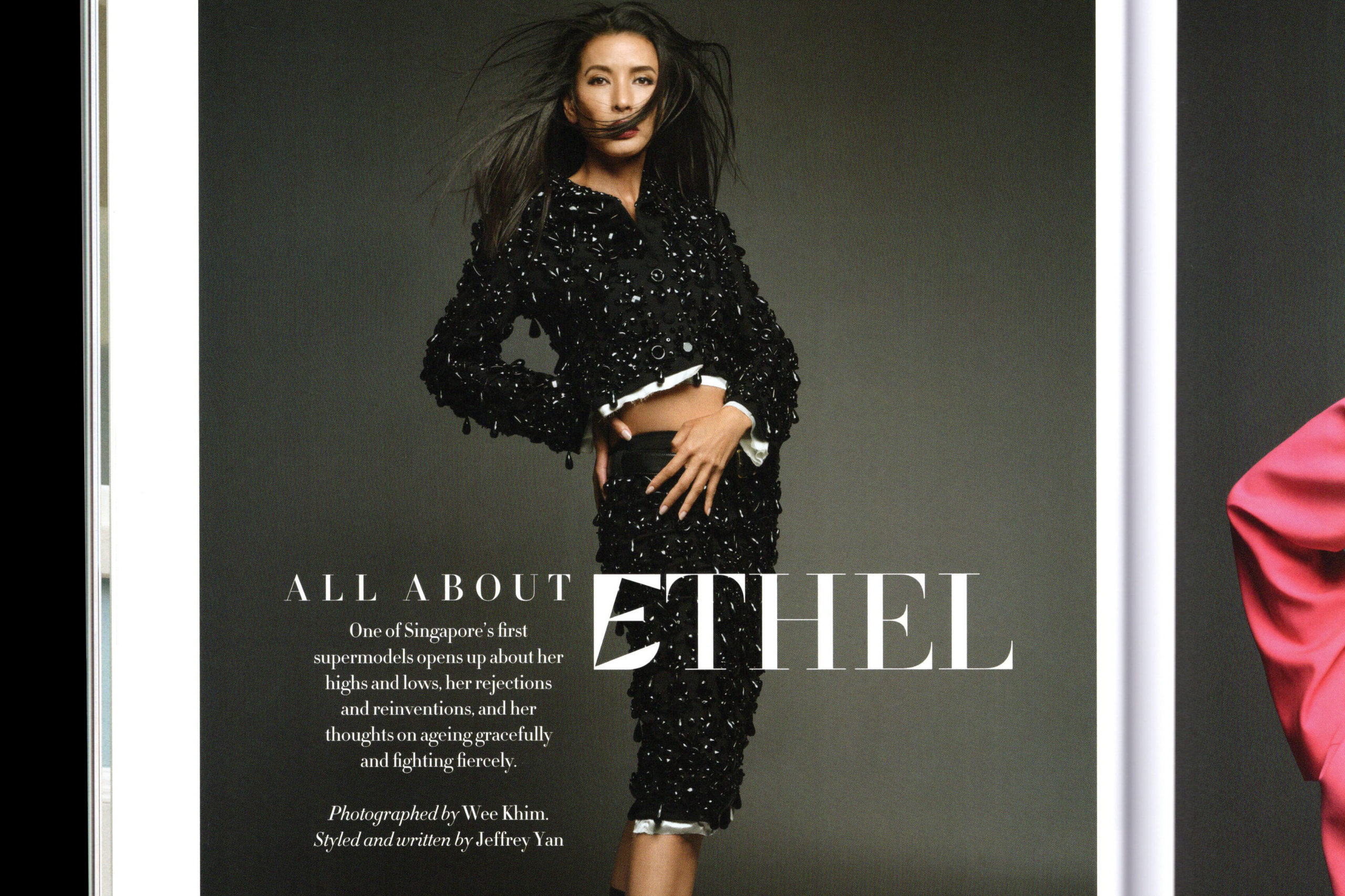
Harper’s Bazaar Singapore
commissioned the studio to design letterforms to complement the magazine’s house font (Didot) for the April 2022 issue.
The letterforms’ main structure were drawn with (and limited to) only the counters, apertures and angles of Didot’s letters, creating a bizarre, yet harmonious letters that encourages a more dynamic usage of Didot. (Credits — Publication layout: Harper’s Bazaar Singapore, SPH Media Limited)
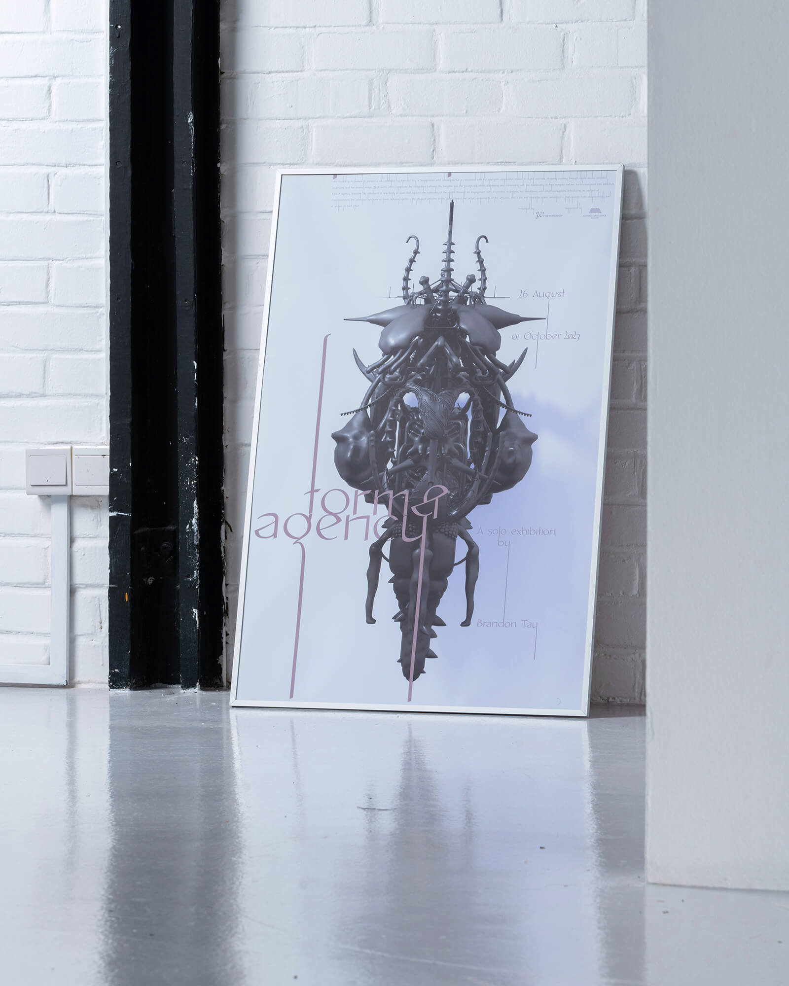
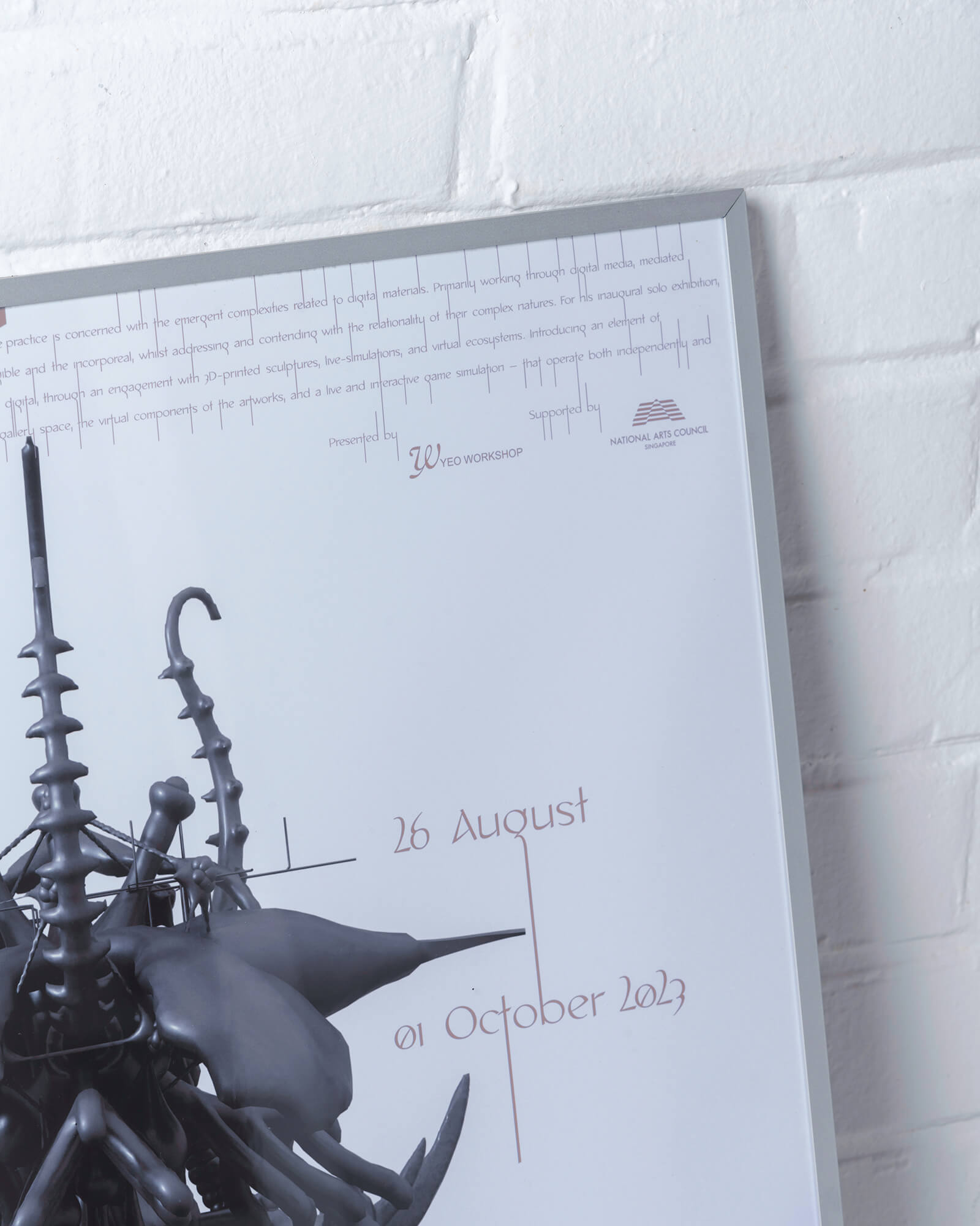
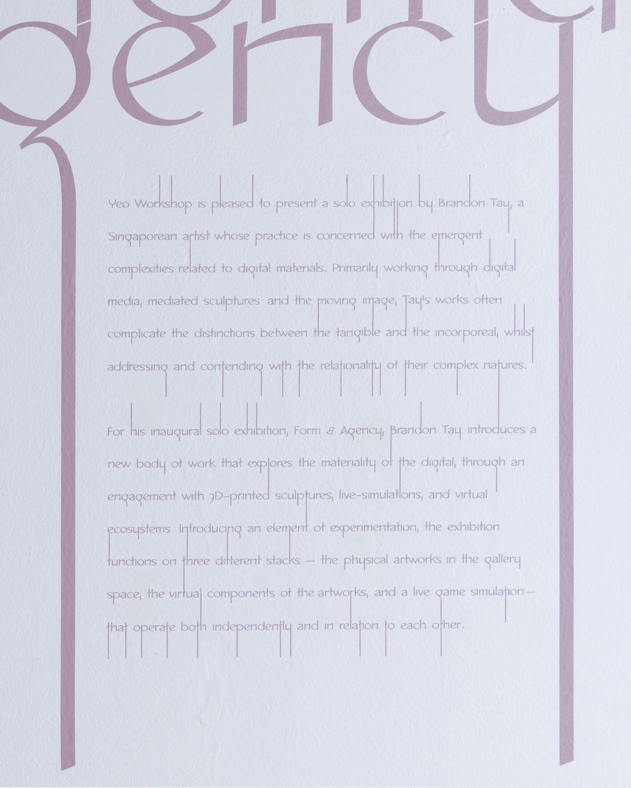
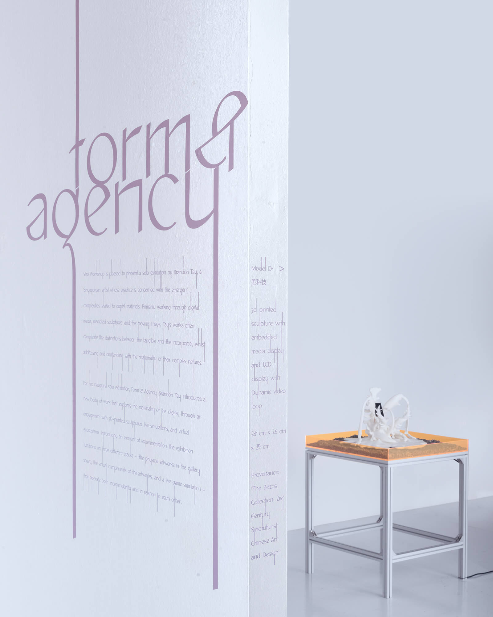
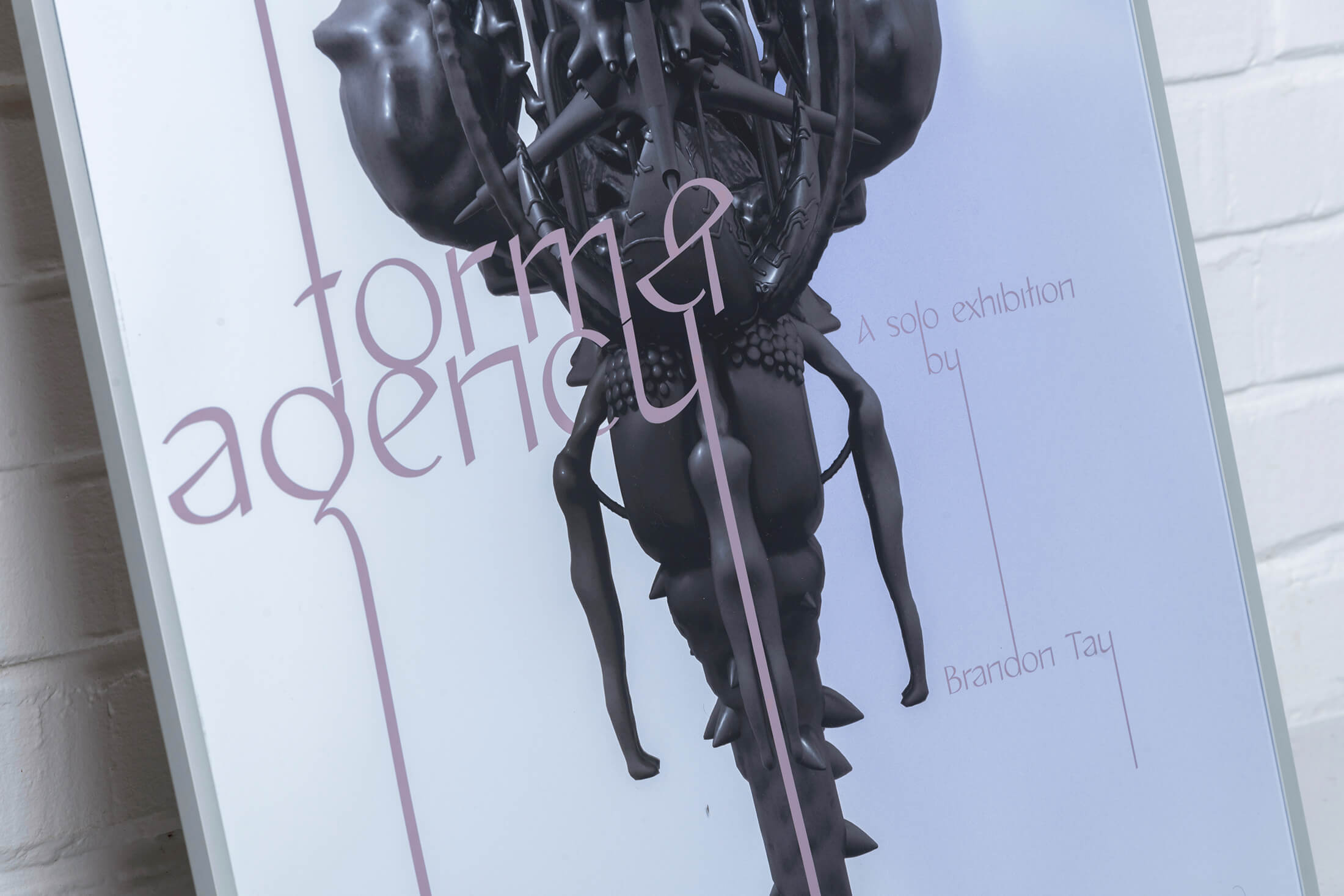
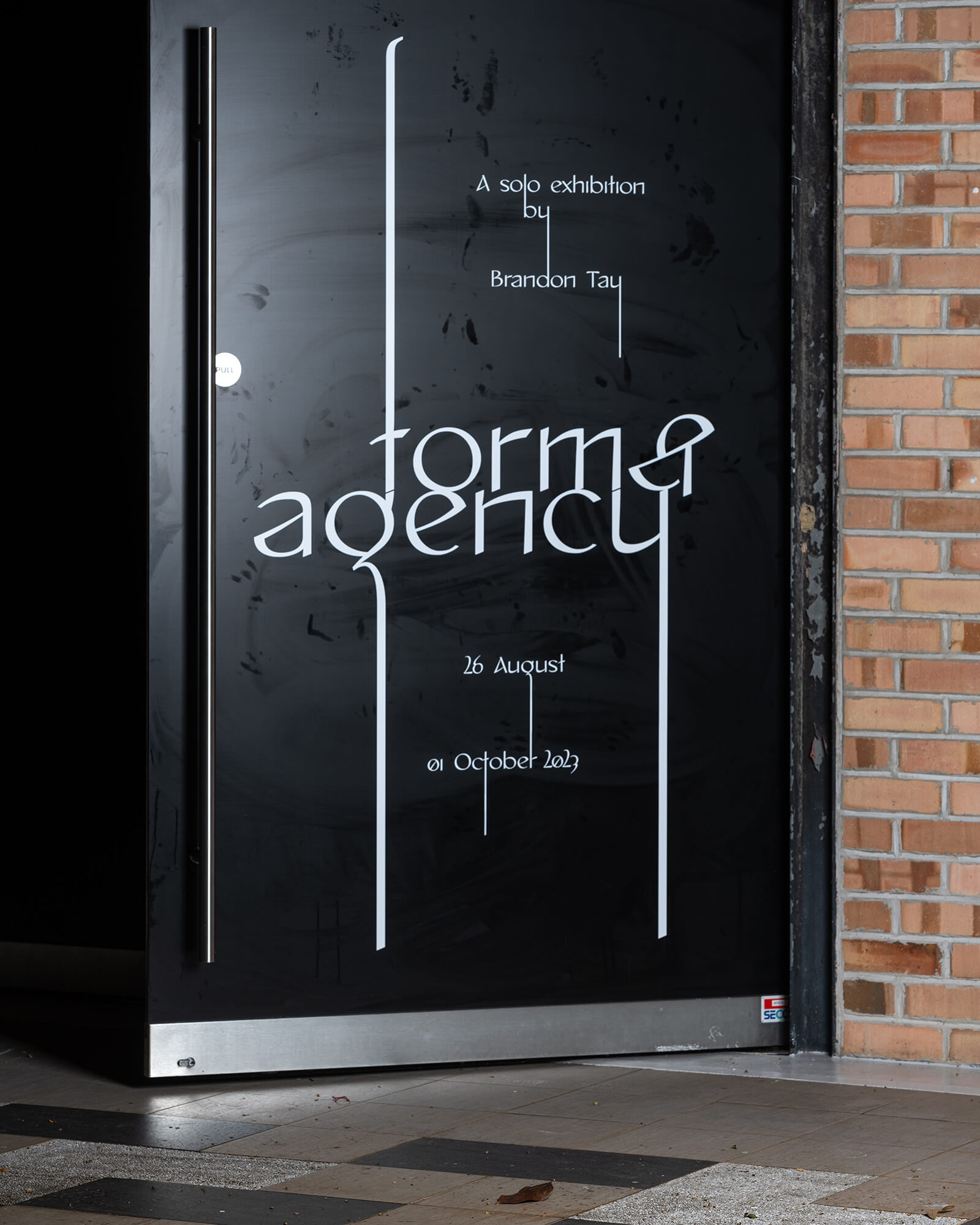
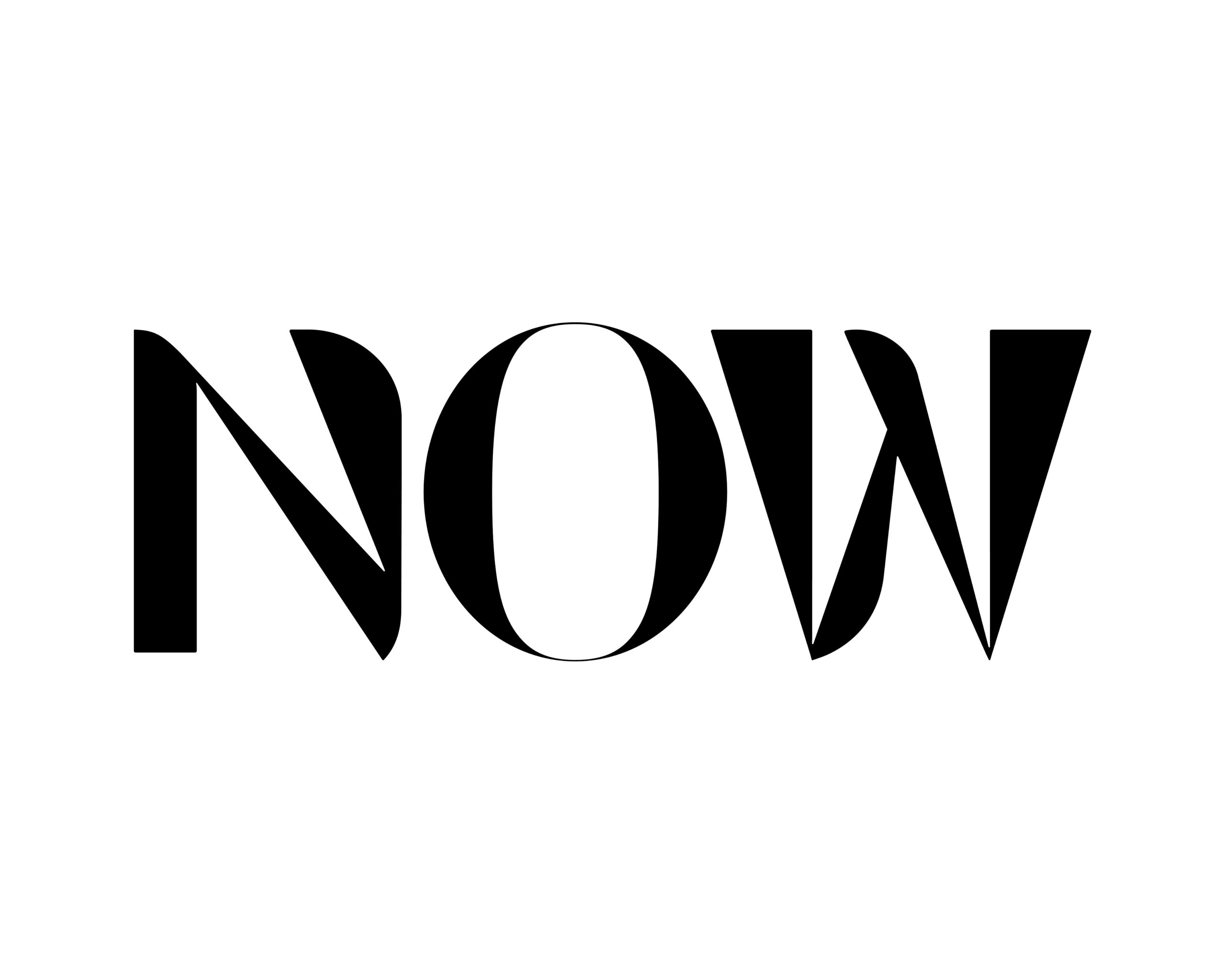
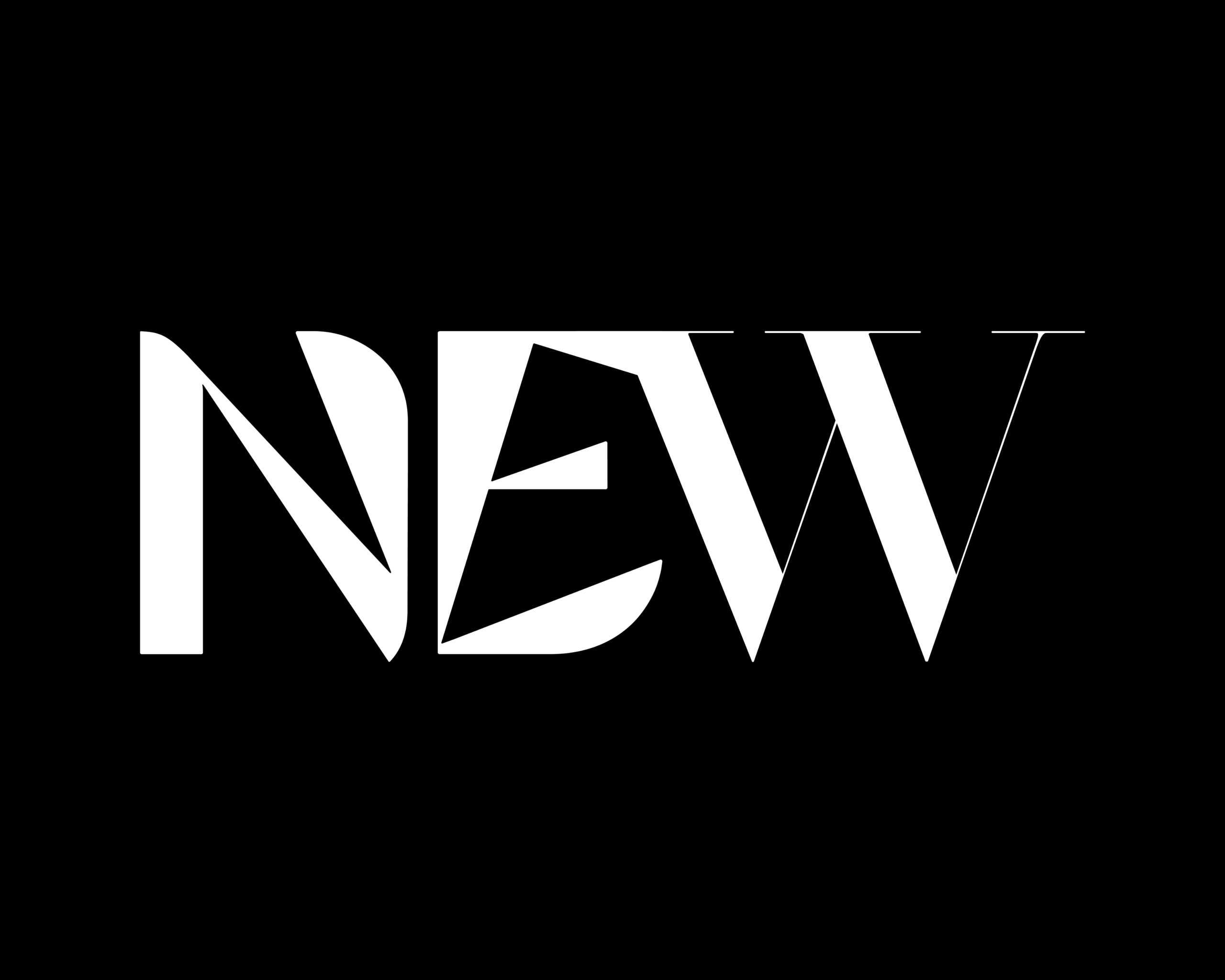
Form & Agency
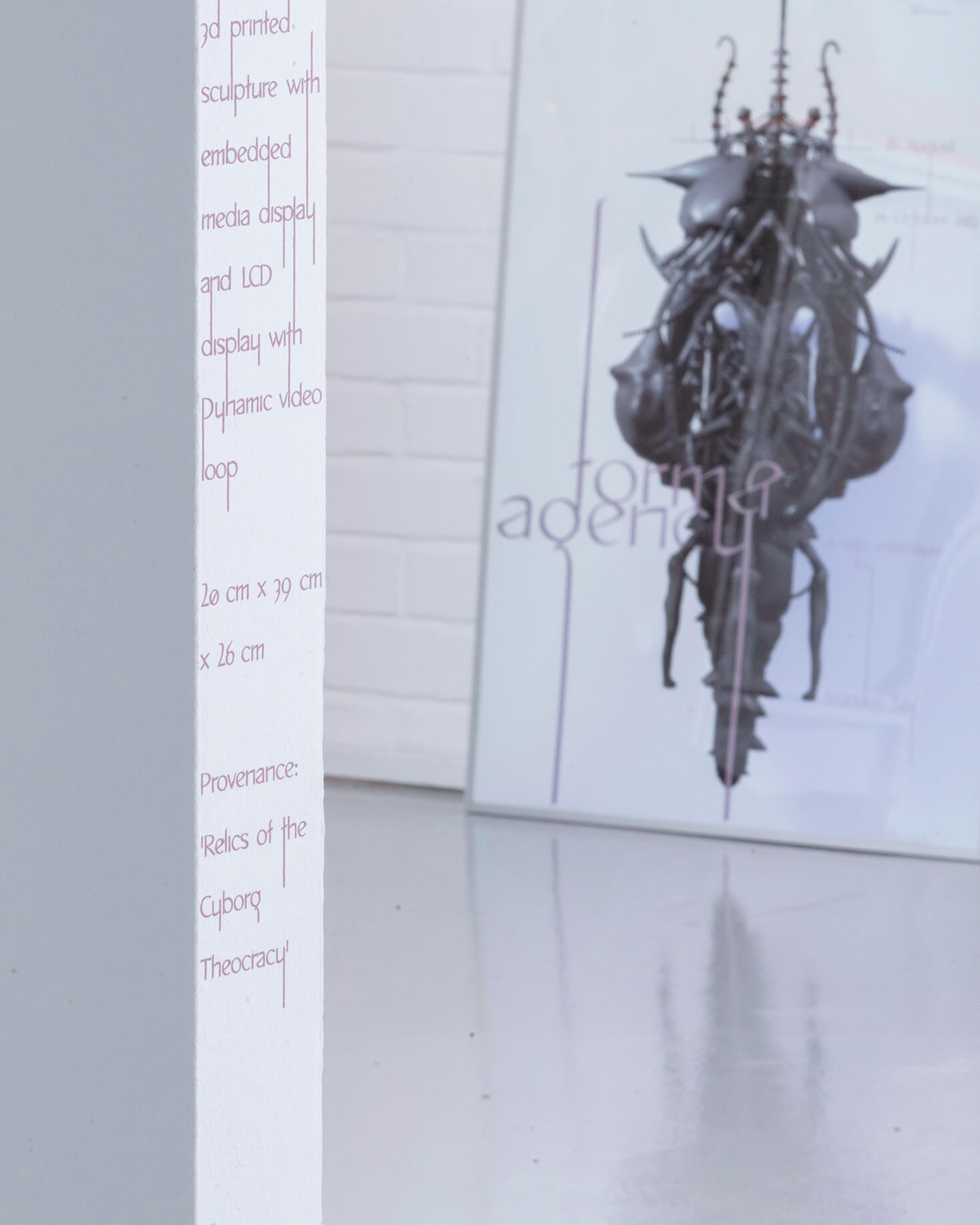
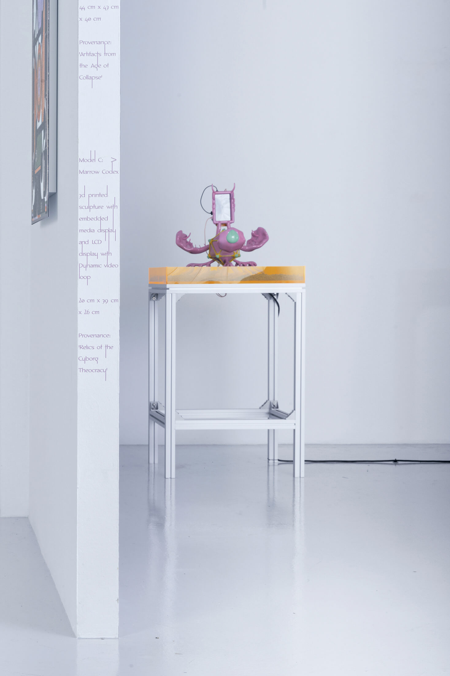
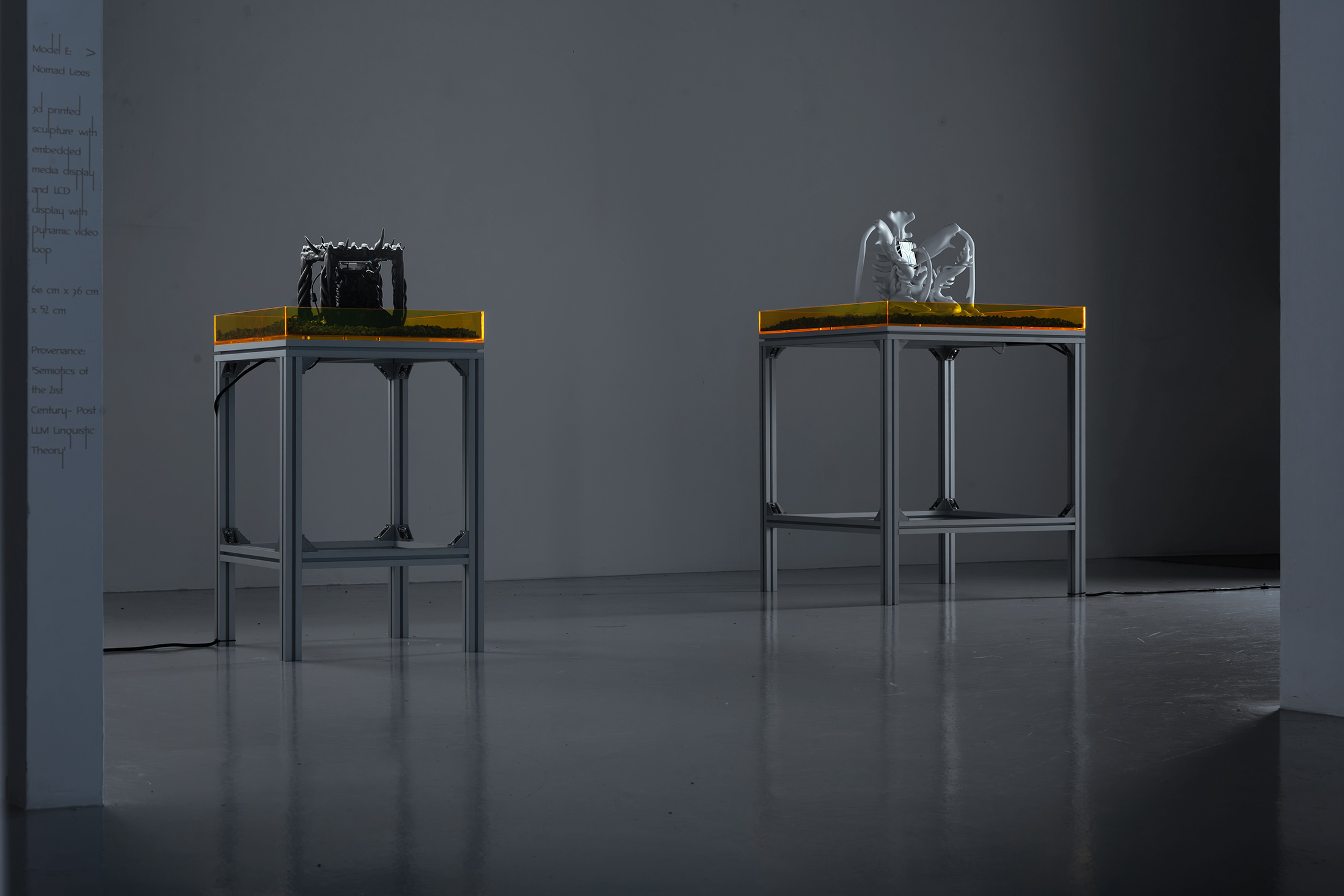
is a solo exhibition by artist Brandon Tay that explores the materiality of the digital. Presented on three stacks — the physical, the virtual, and live simulation components — the visual identity echoes the verticality of the stacks with a custom typeface and code logic. Shown in Yeo Workshop, Singapore.
The experimental variable typeface, As above, so below with elongated ascenders and descenders is capable of forming ‘vertical ligatures’, not with lateral letters but across lines of texts through stems of letterforms. This verticality is reflected through the placement of texts on edges of walls in the gallery space; of thresholds between spaces. Vertical ligatures challenging the linearity of languages; of words in lines; of thresholds between symbols and meanings. (Credits — Curator: Rafi Abdullah; Exhibition design: Amirul Nazree, set up w/ Nghia Phung; Website design and build: w/ Bảo Anh Bùi; Exhibition Photography: Jonathan Tan)