
/
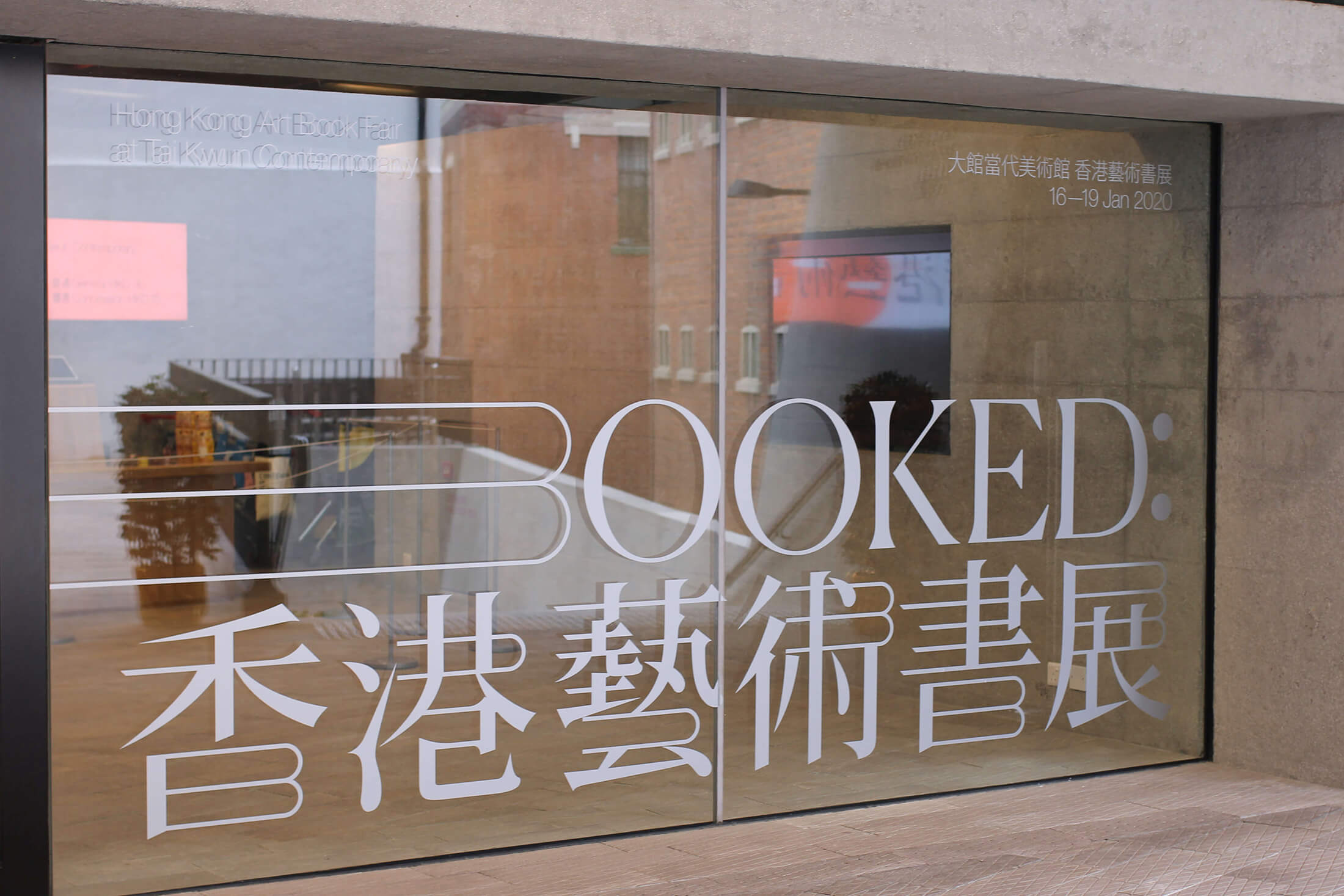
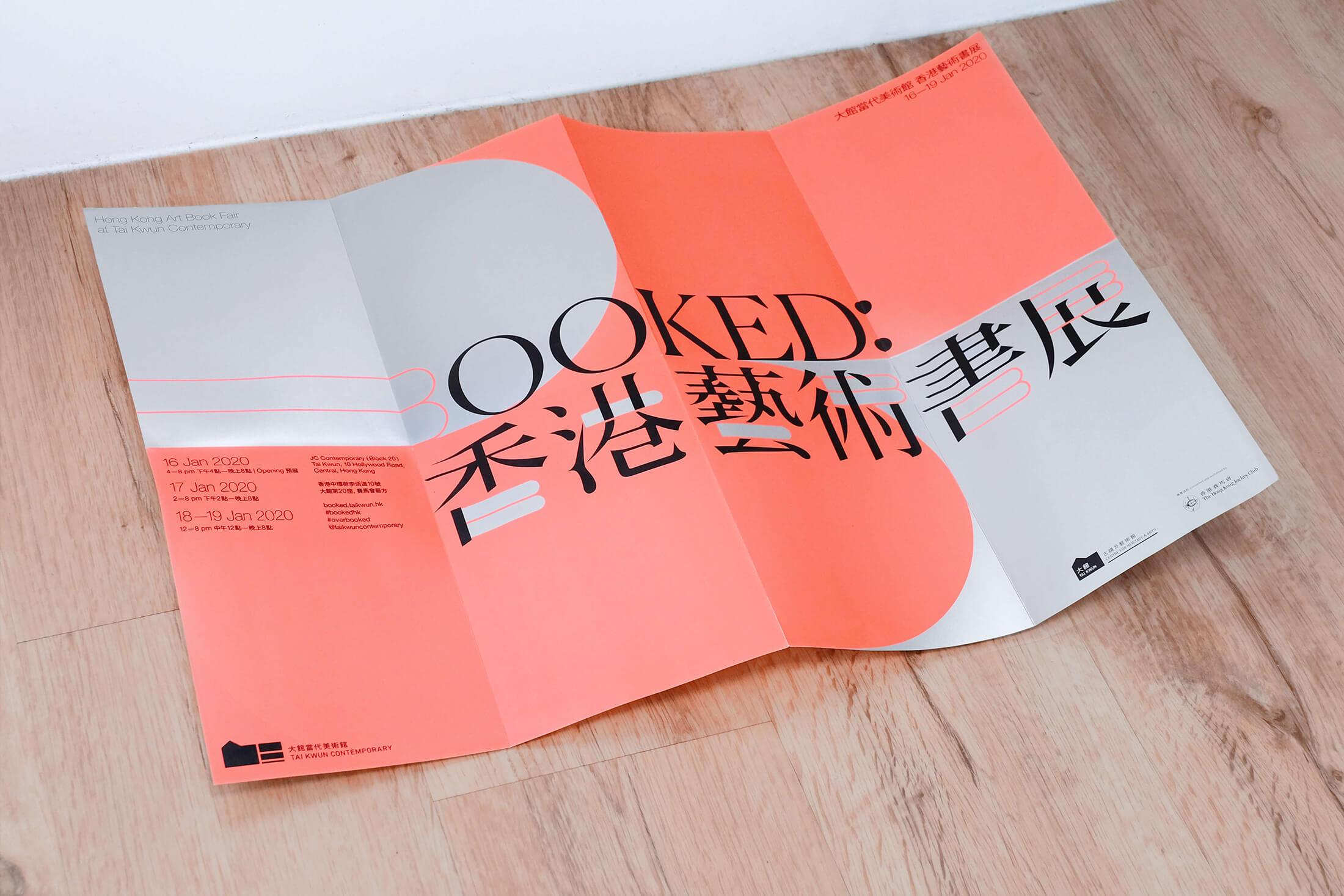
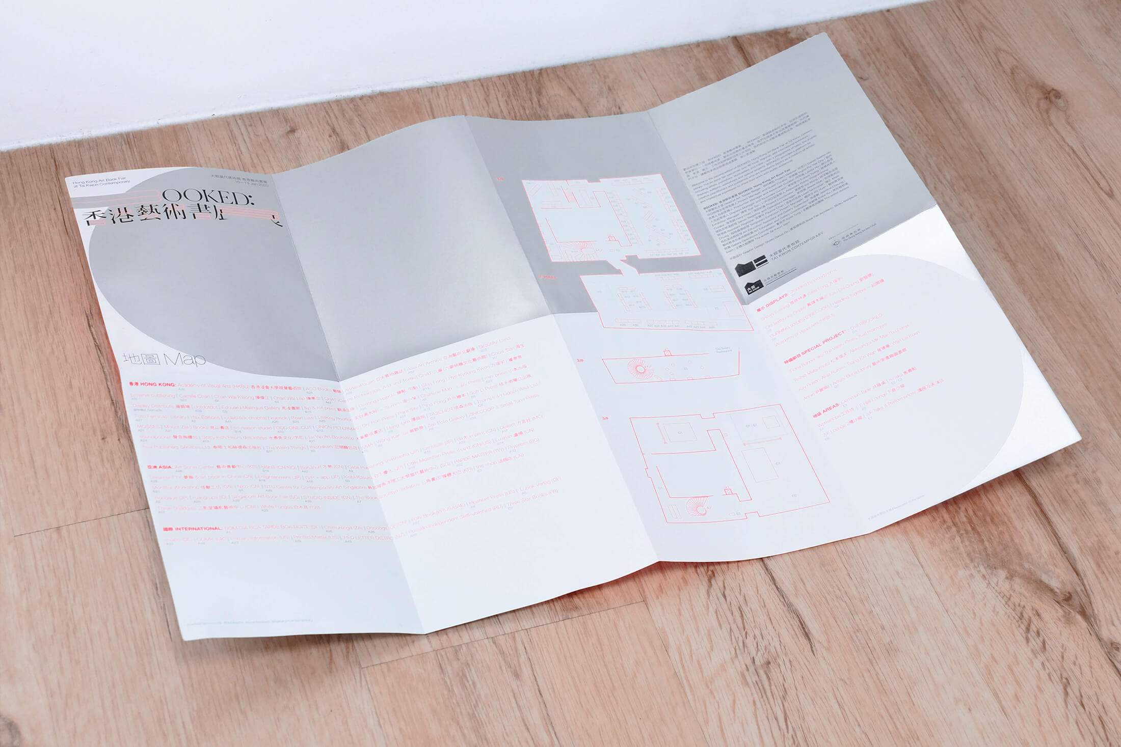
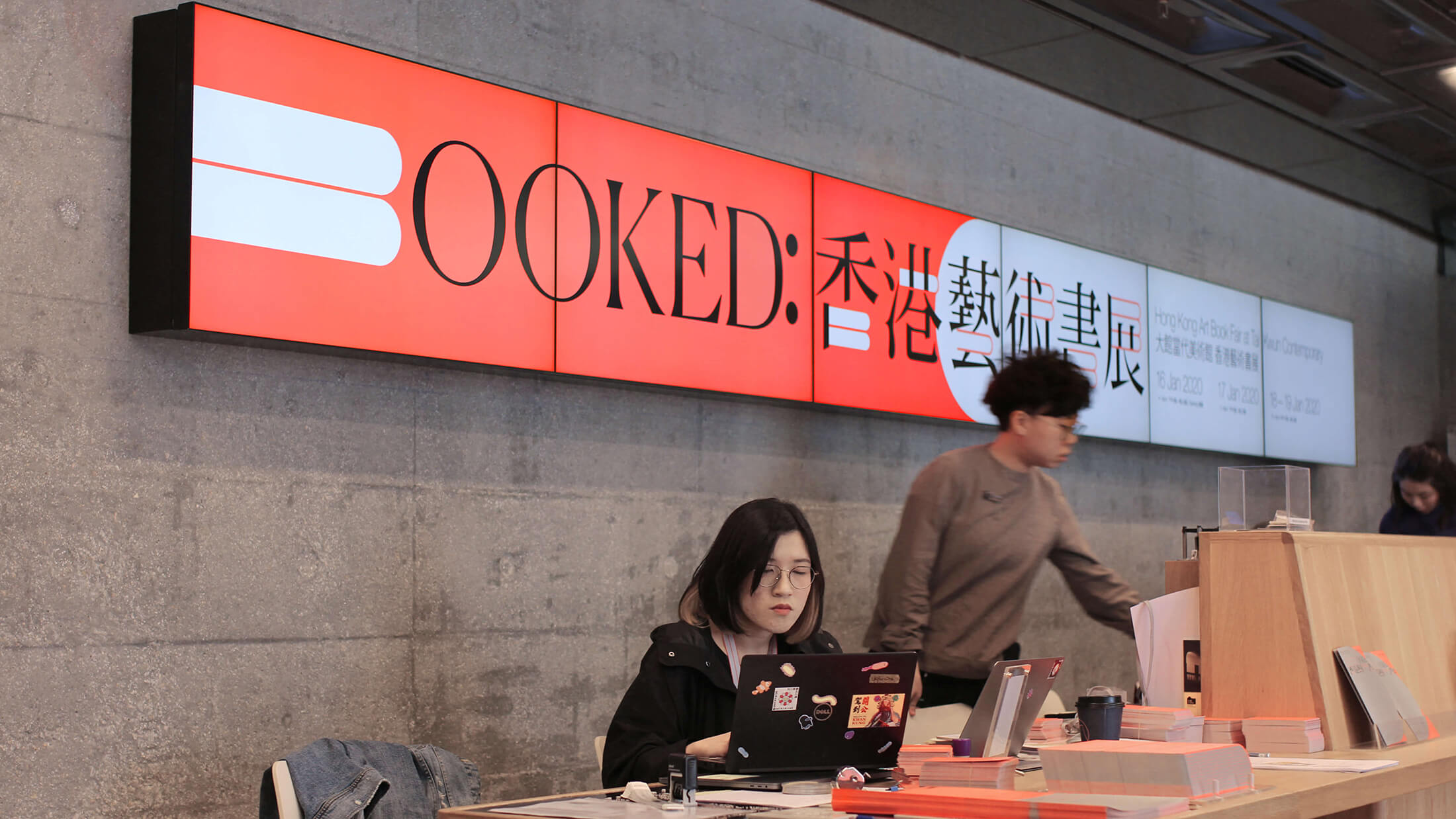
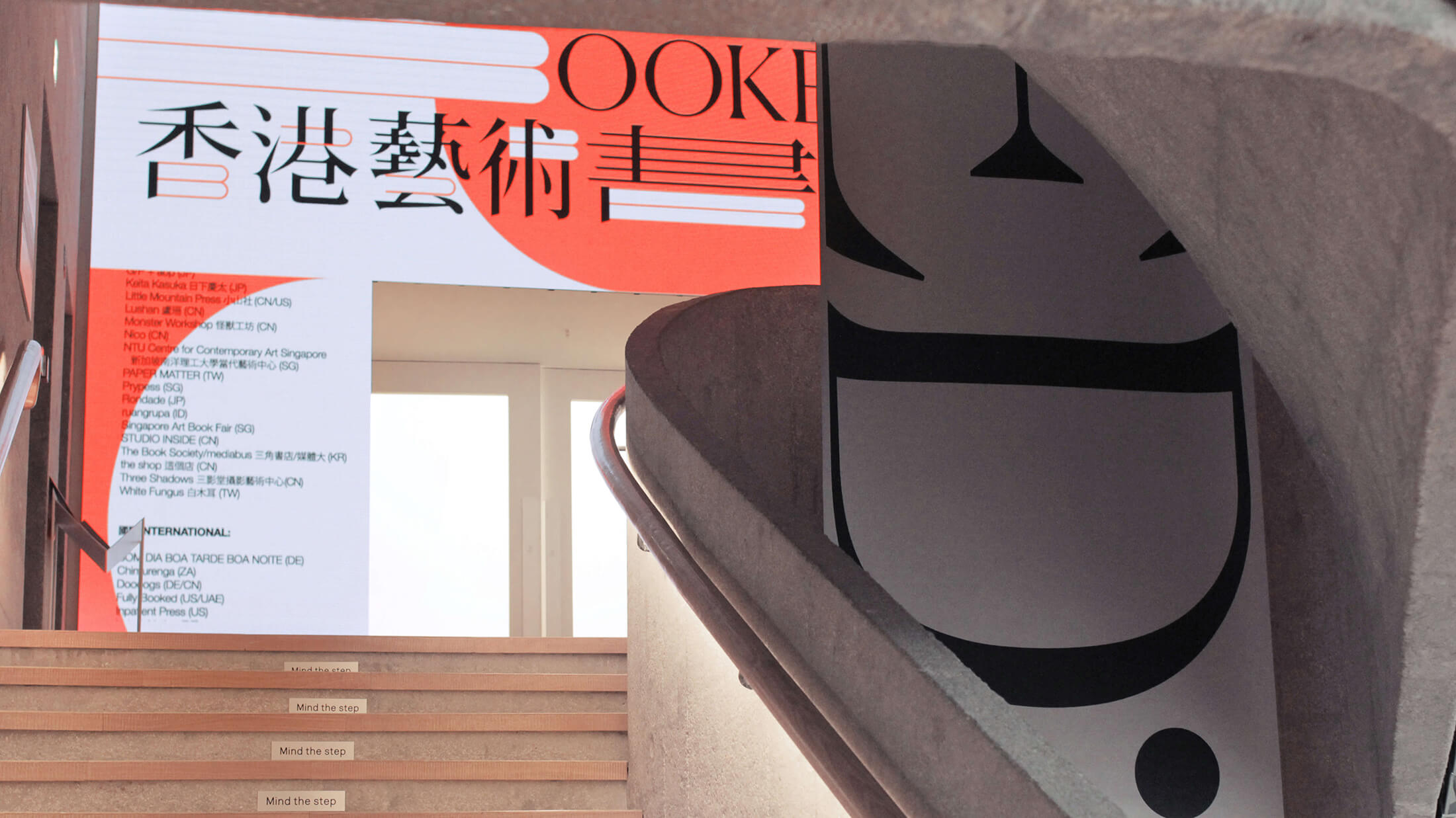
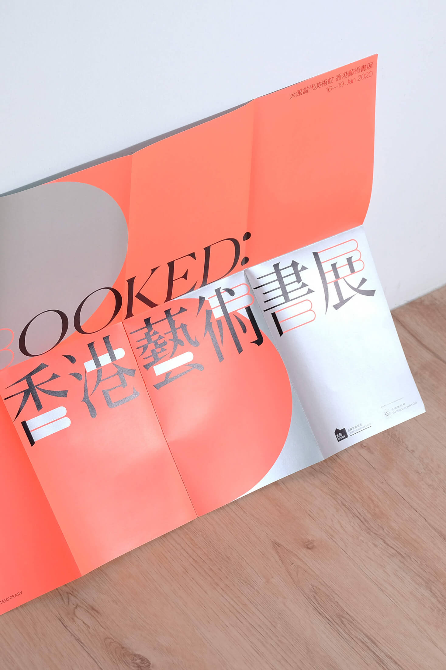
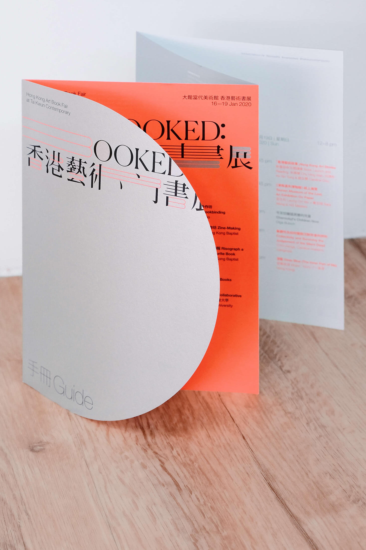
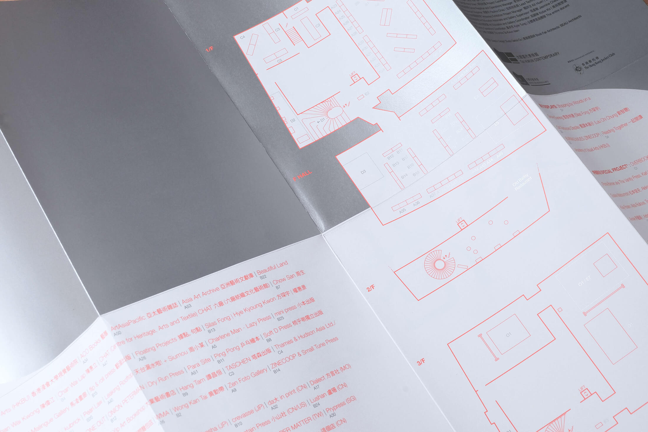
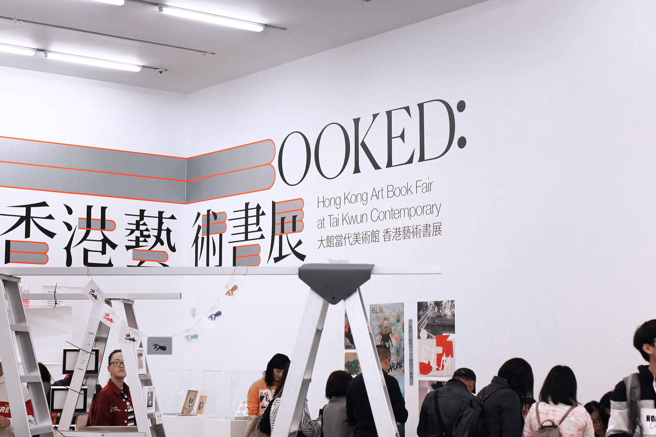
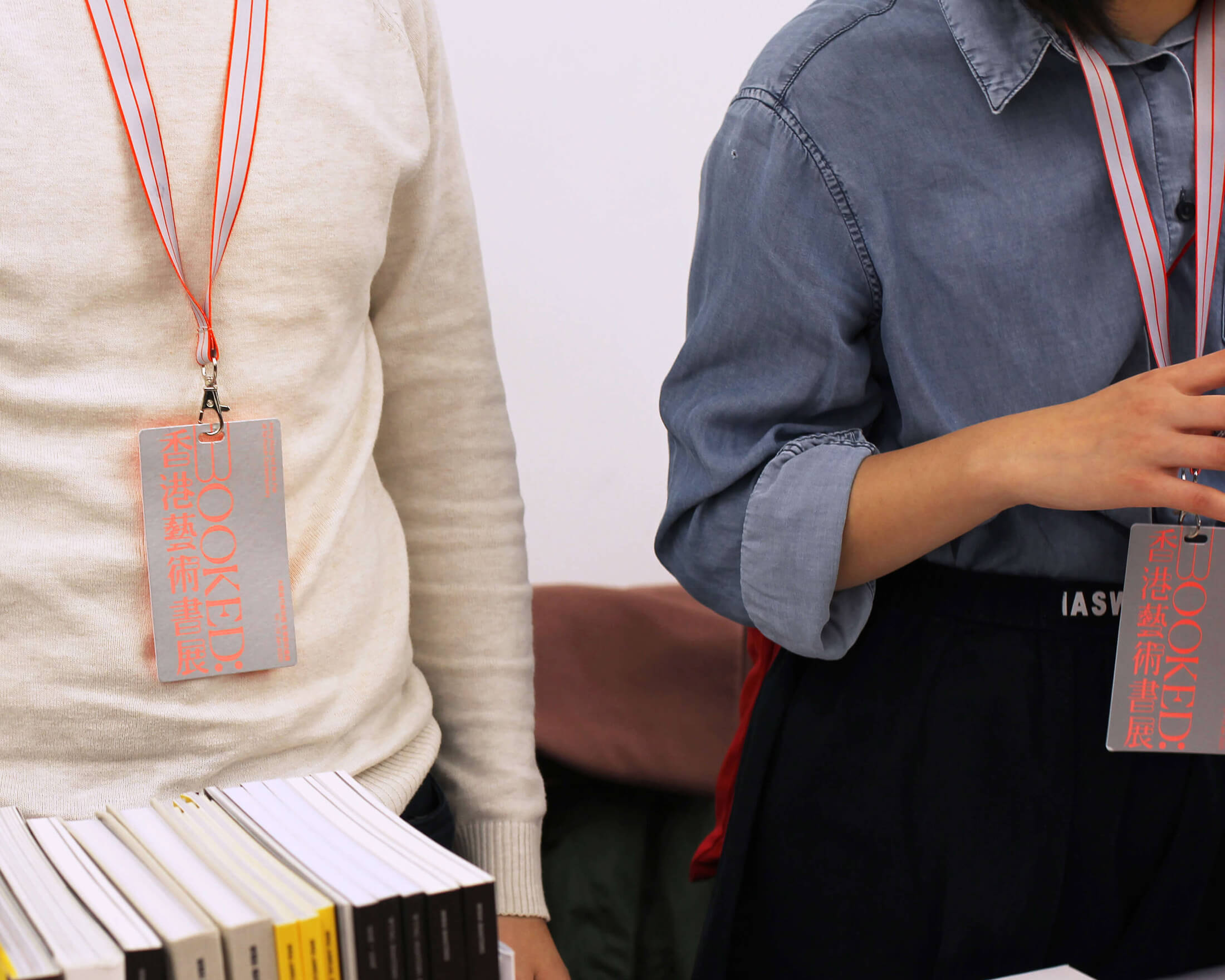
BOOKED: Hong Kong Art Book Fair
is an annual fair presented by Tai Kwun Contemporary that celebrates art books from local and international publishers, artists and booksellers.
(Credits — Animation, Site photography: Izzul Jumat; Fair Architect: BEAU Architects)
/projects/form-and-agency/
/
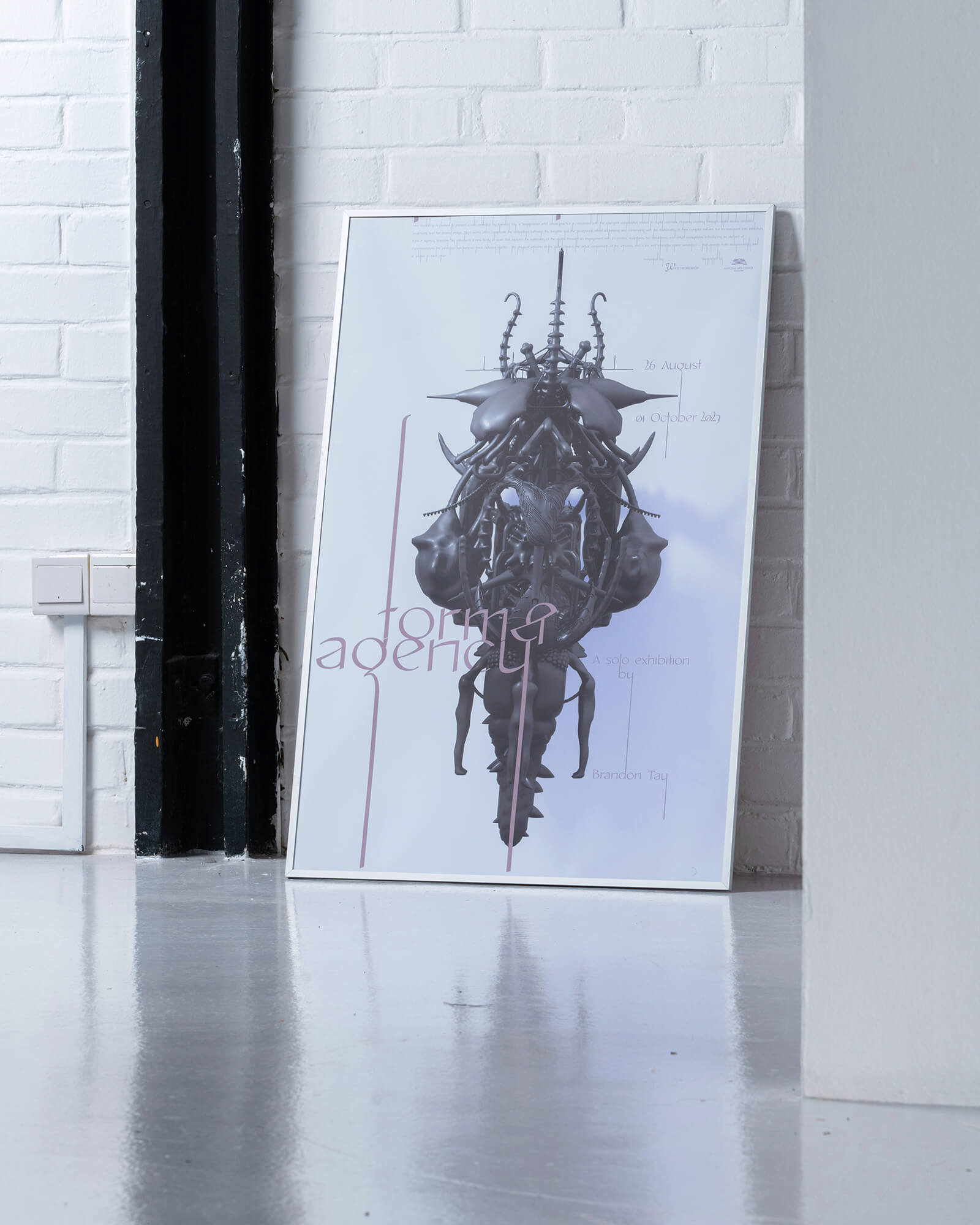
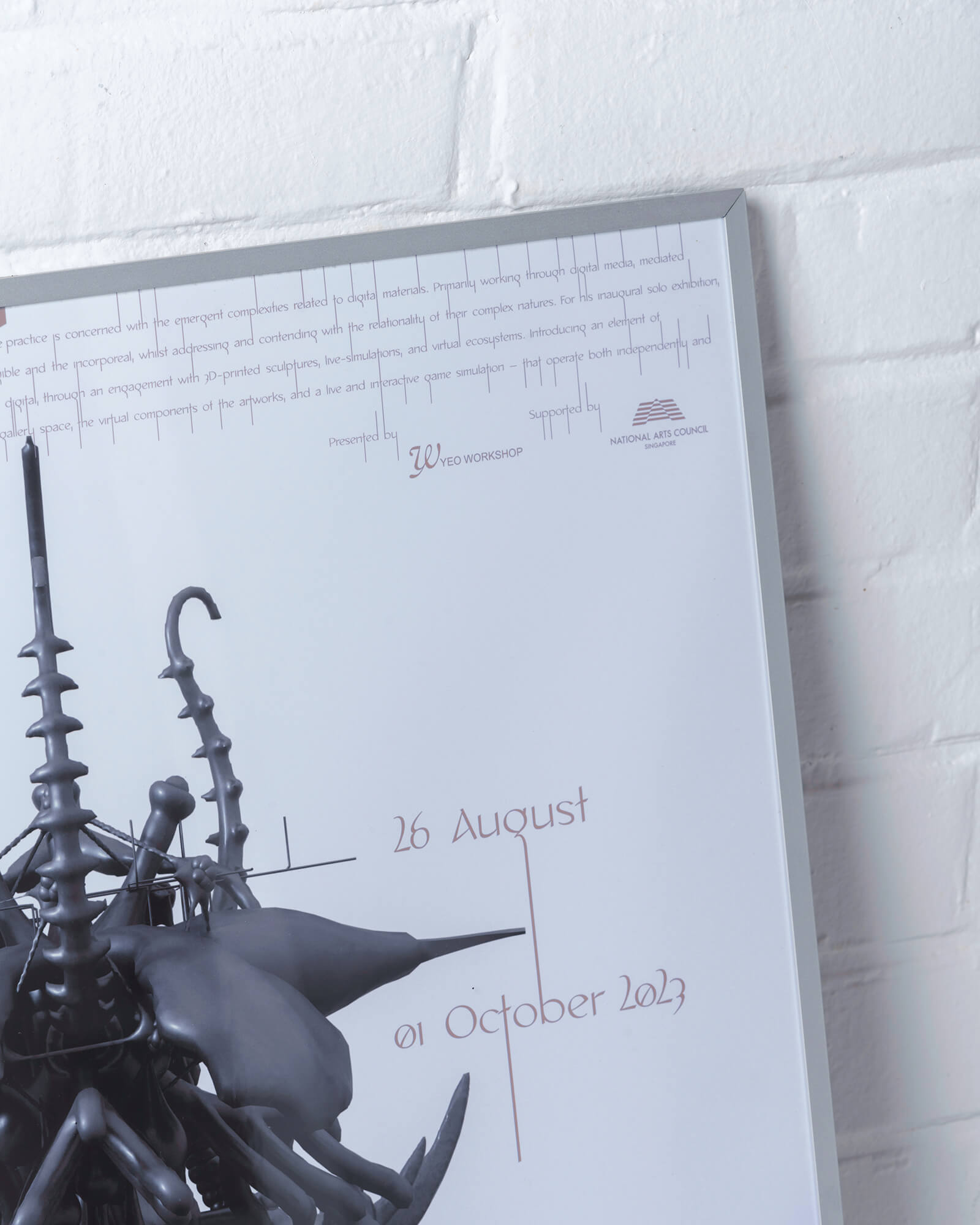
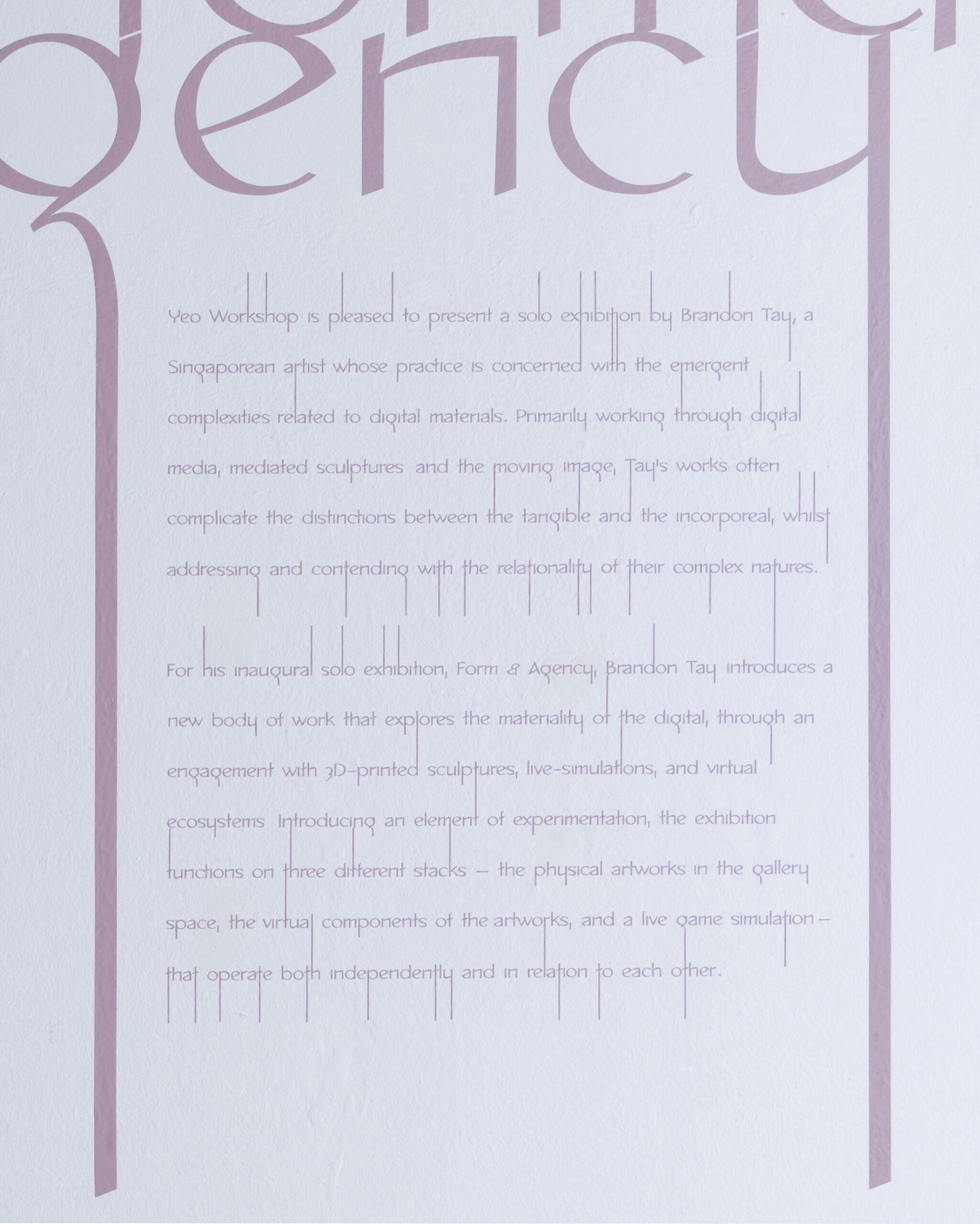
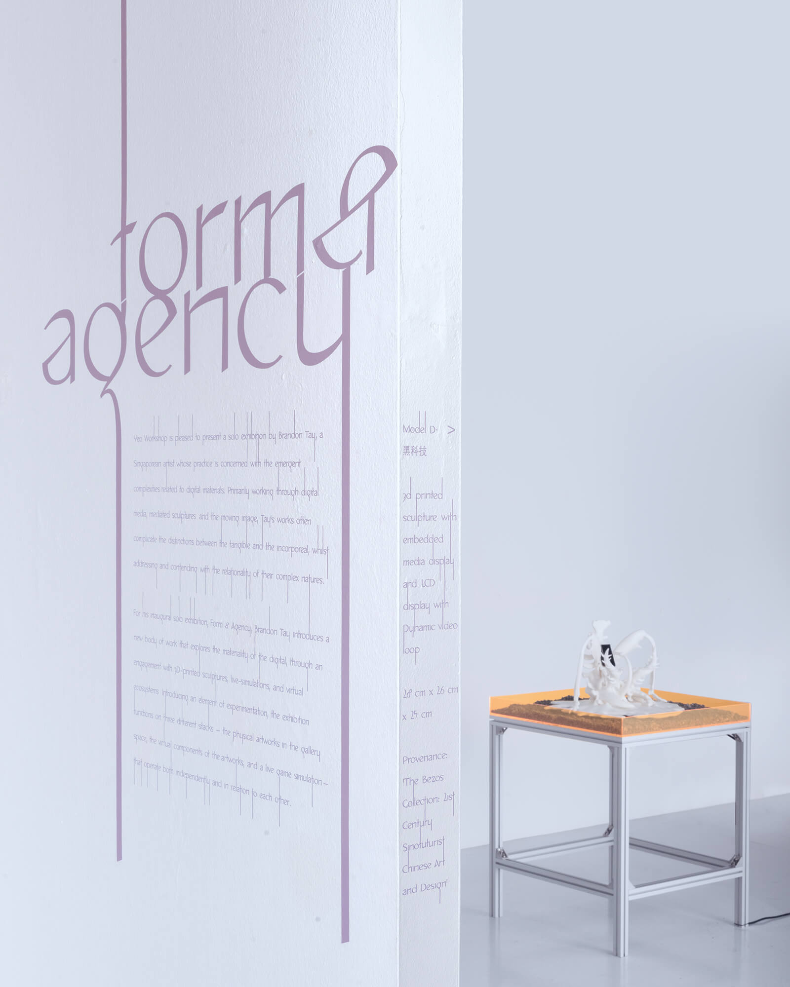
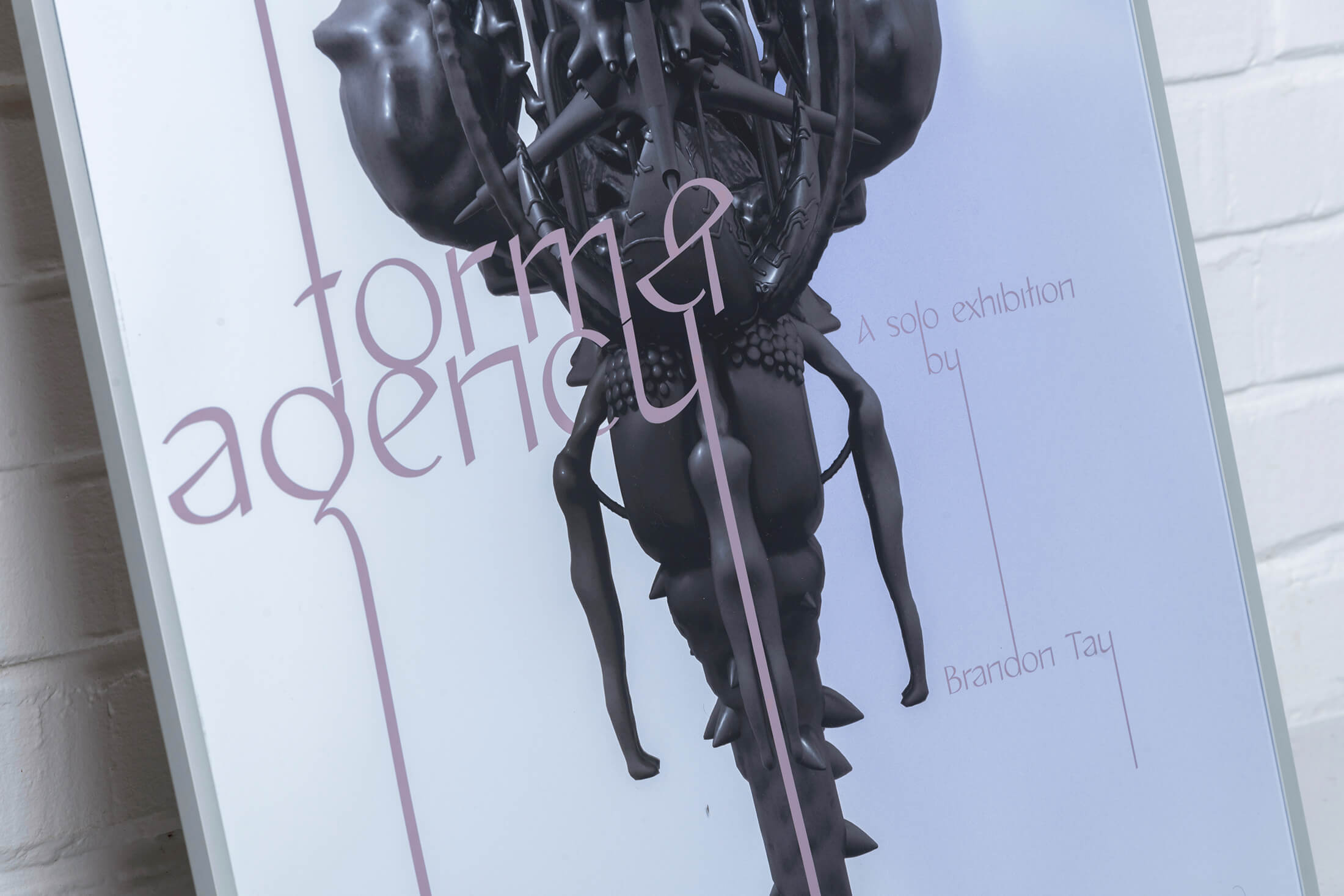
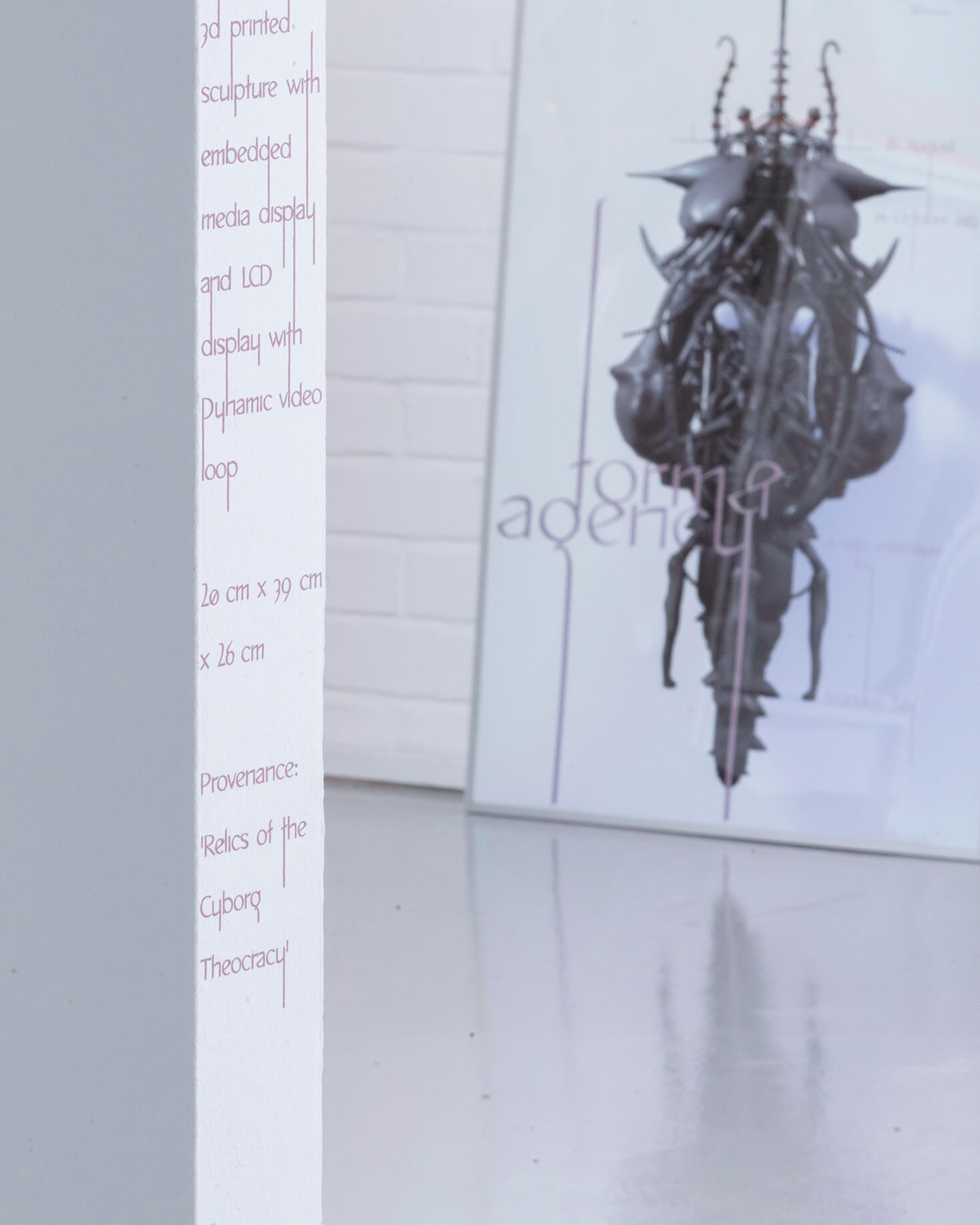
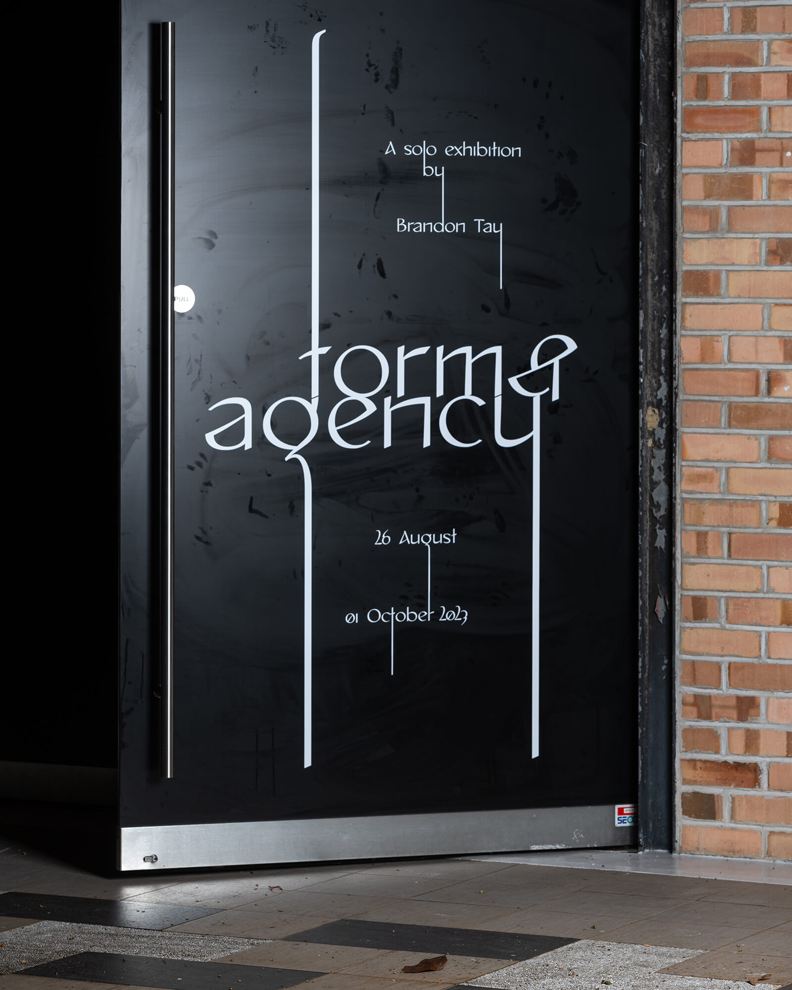
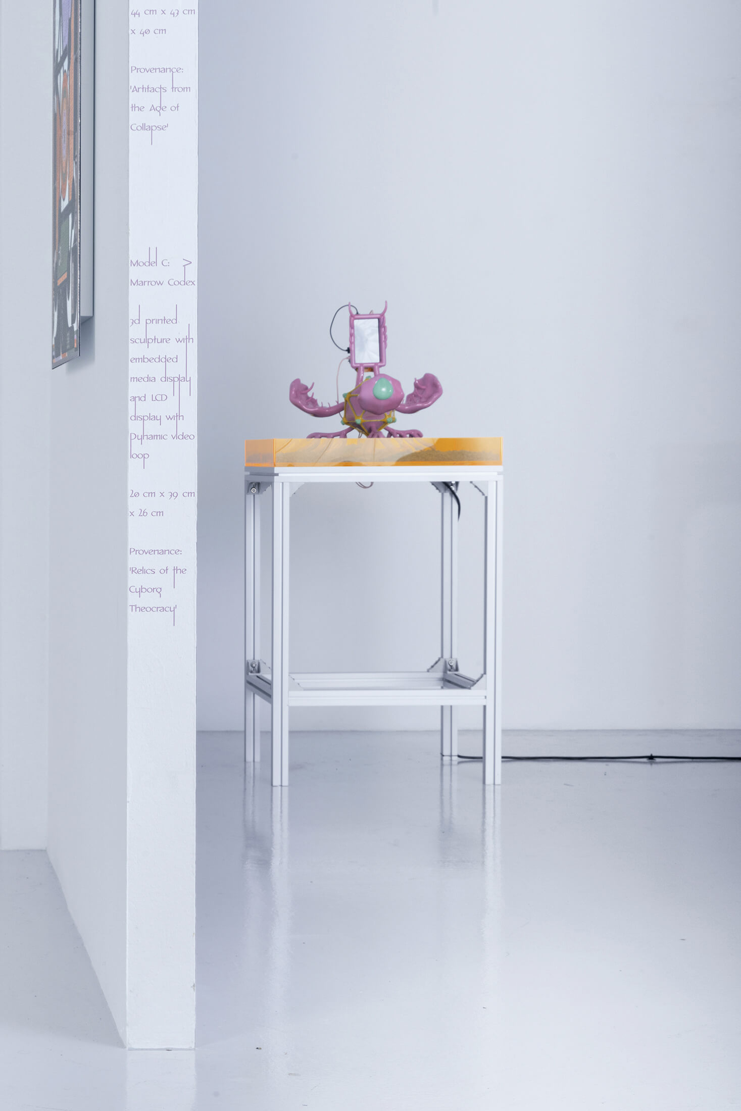
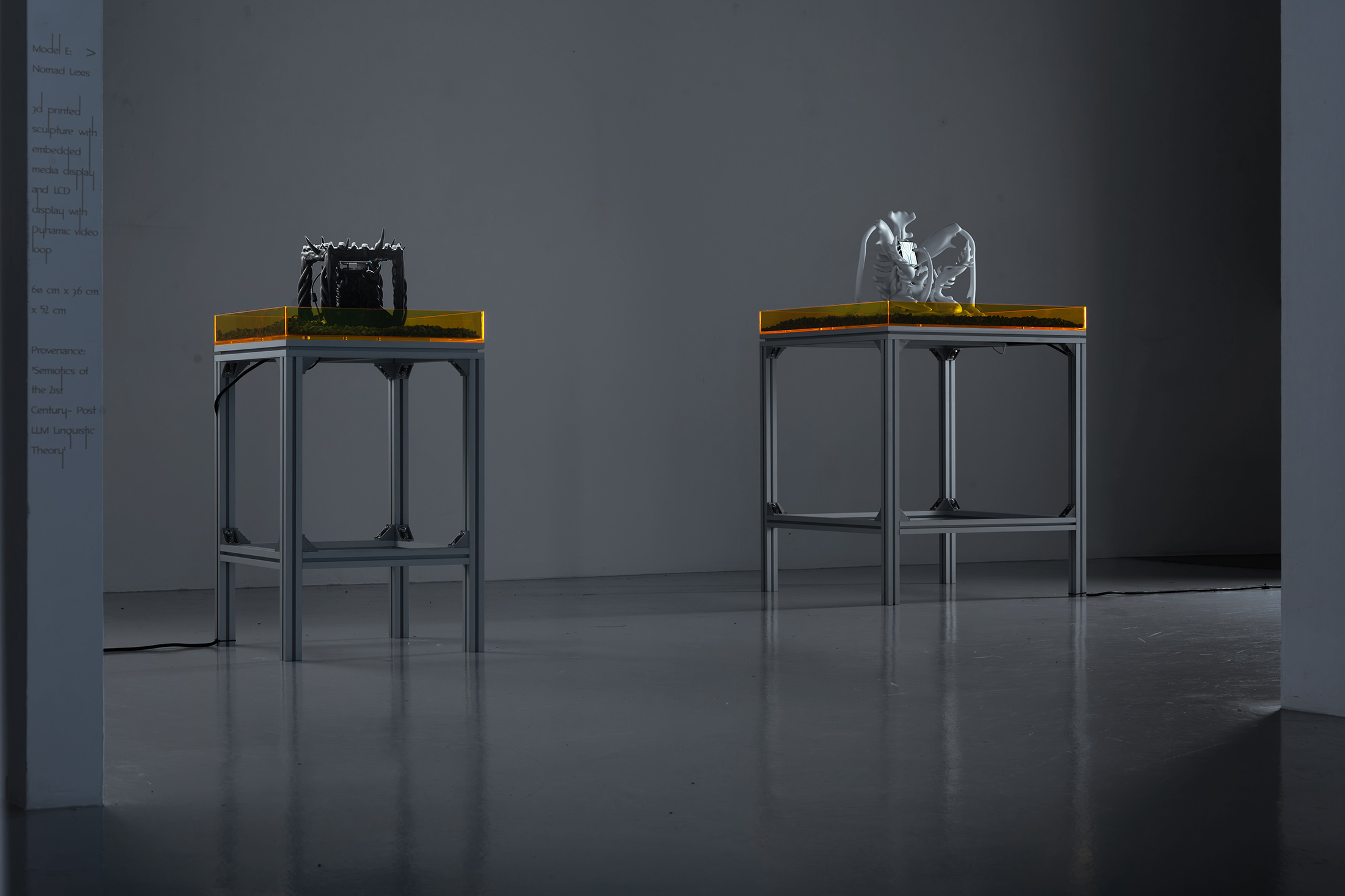
Form & Agency
is a solo exhibition by artist Brandon Tay that explores the materiality of the digital.
(Credits — Curator: Rafi Abdullah; Exhibition design: Amirul Nazree, set up w/ Nghia Phung; Website design and build: w/ Bảo Anh Bùi; Exhibition Photography: Jonathan Tan)