/
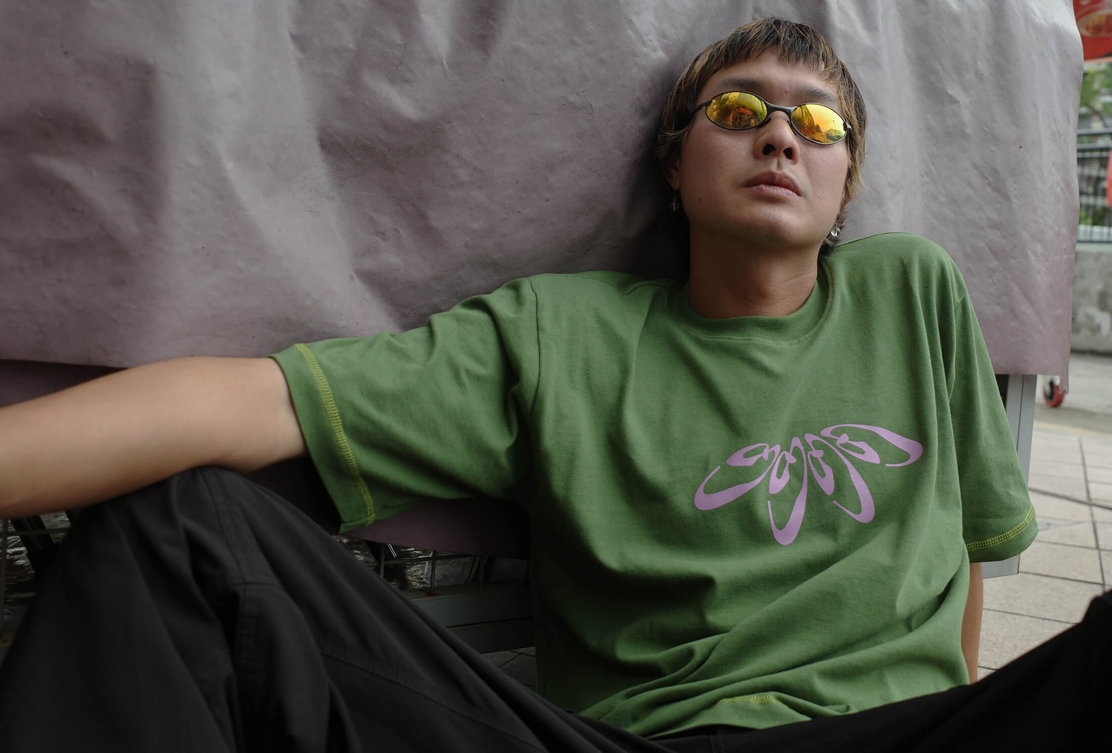
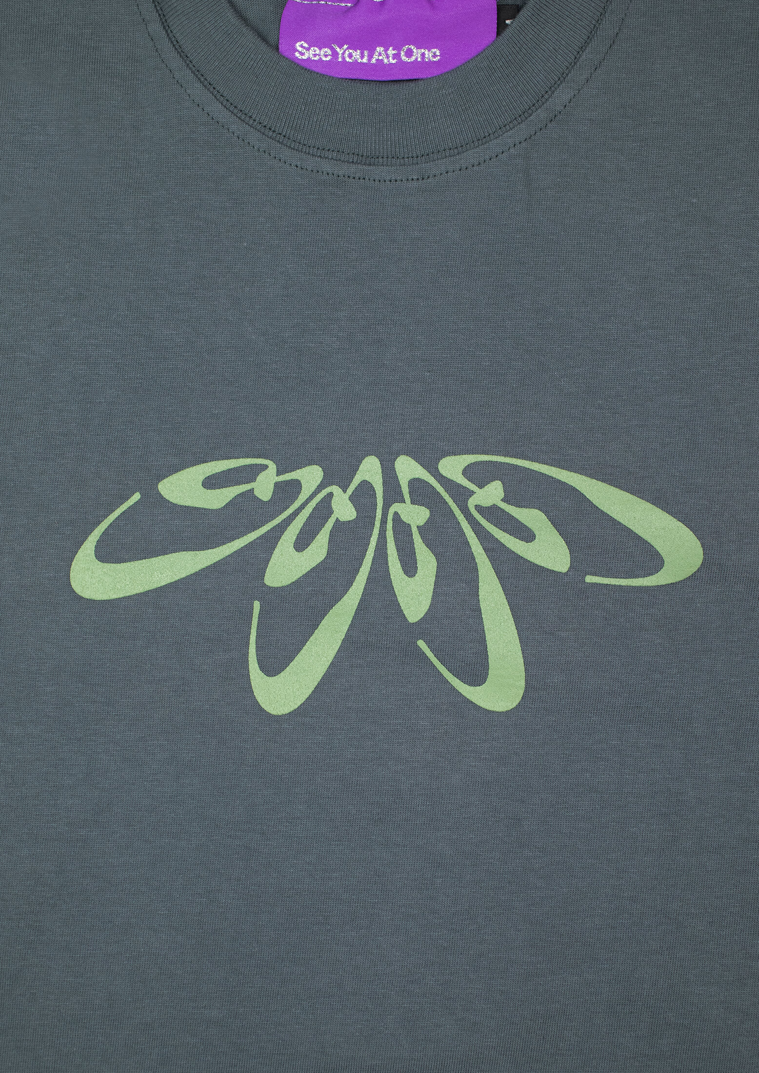
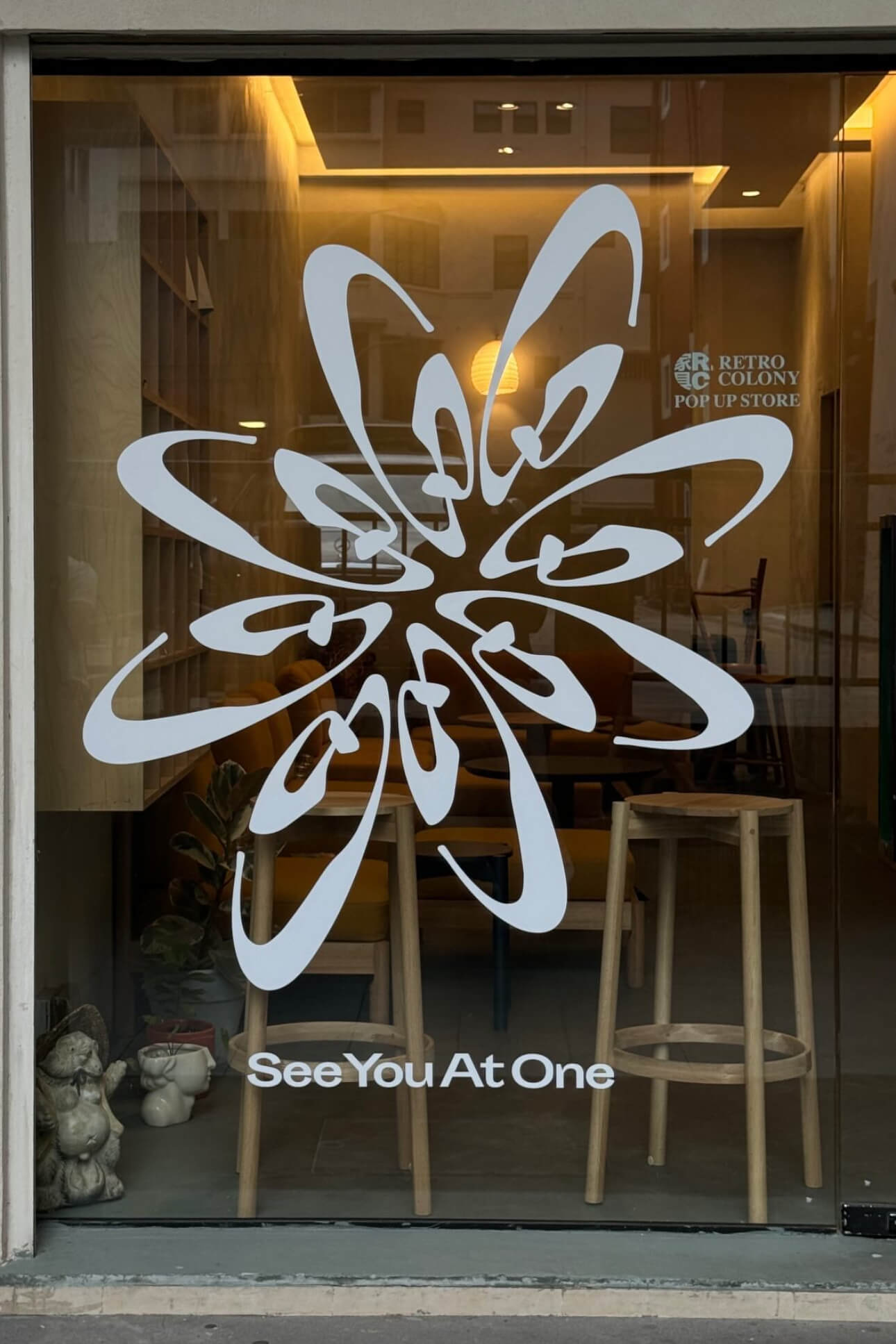
See You At One
is a clothing brand about exploring the other side of clarity, confidence and comfort.
/projects/form-and-agency/
/
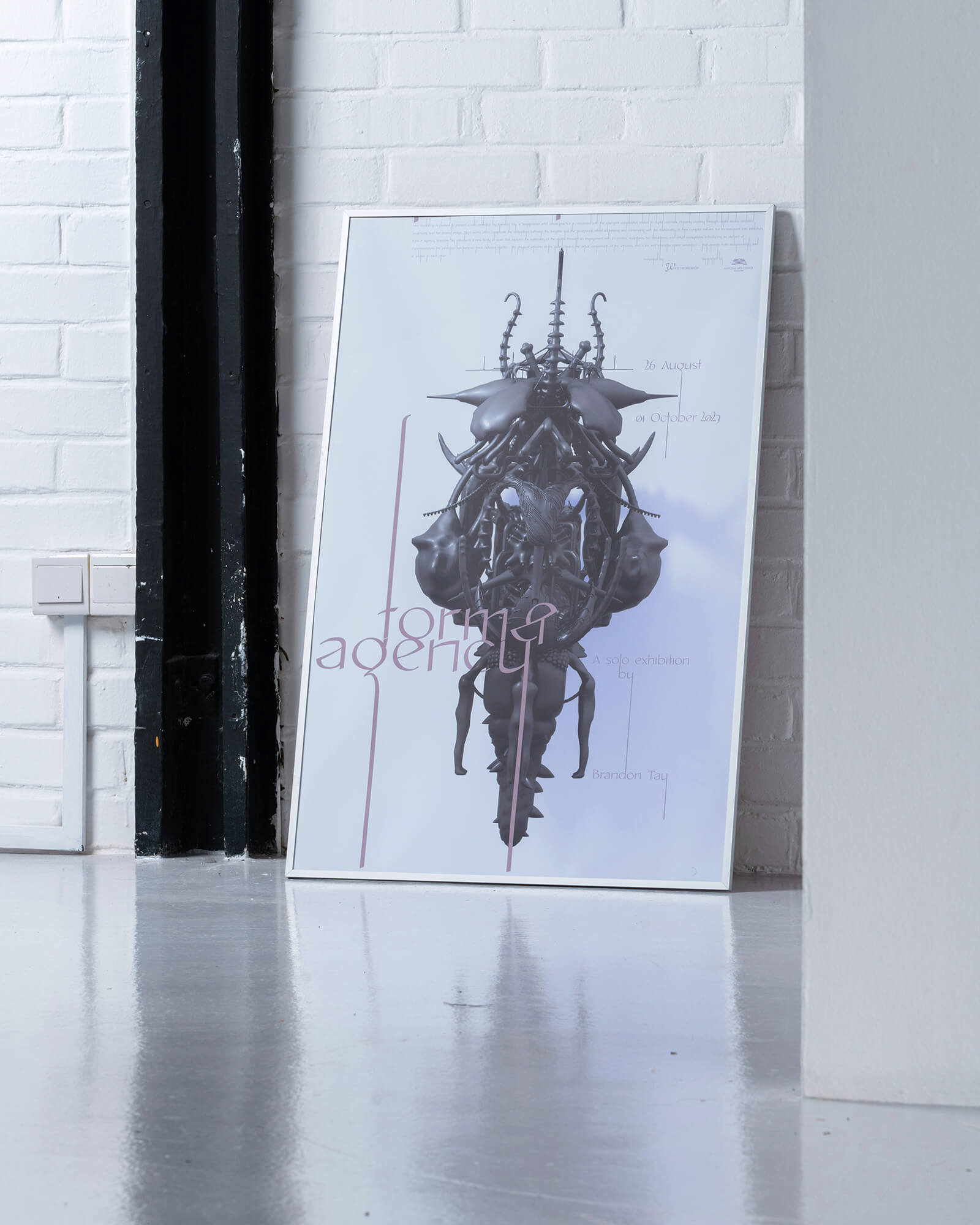
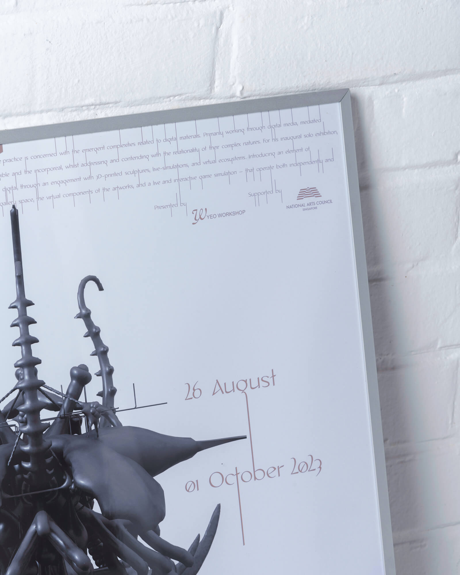
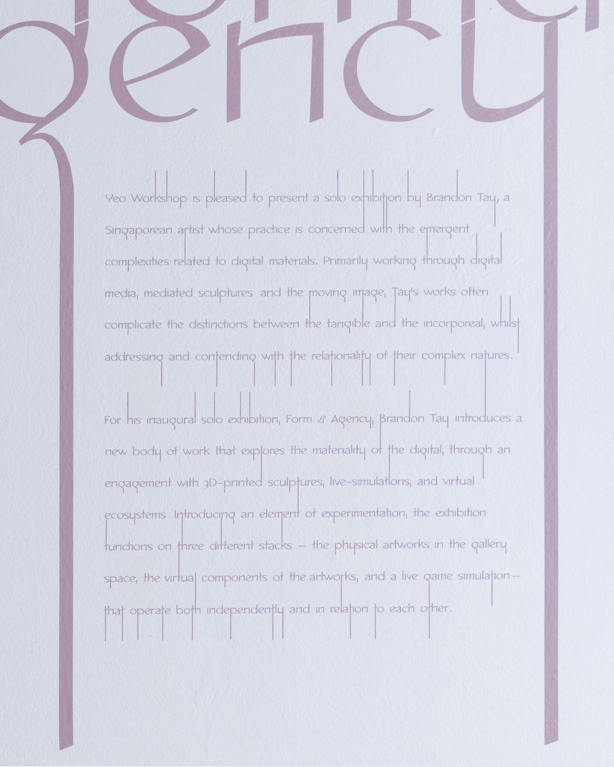
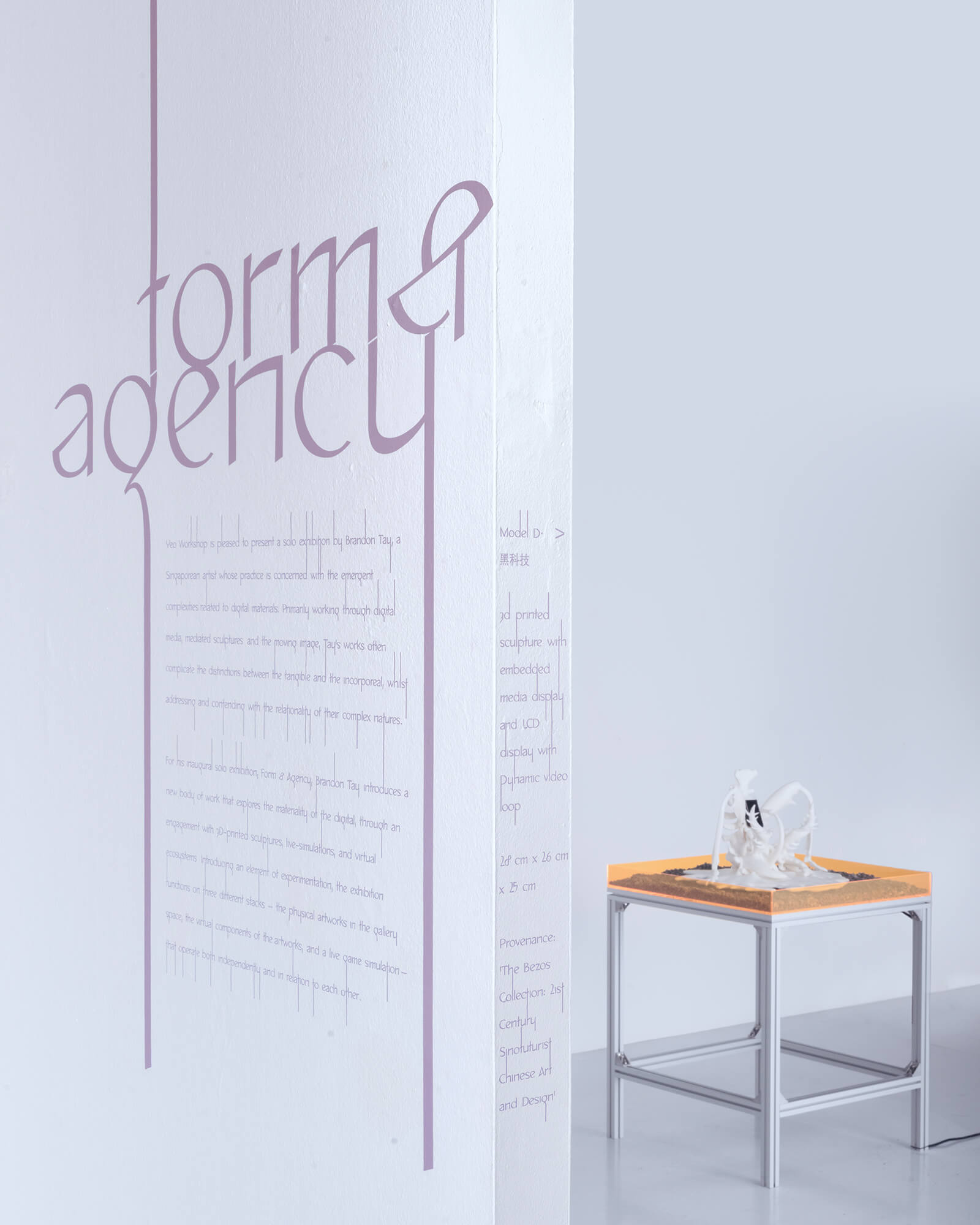
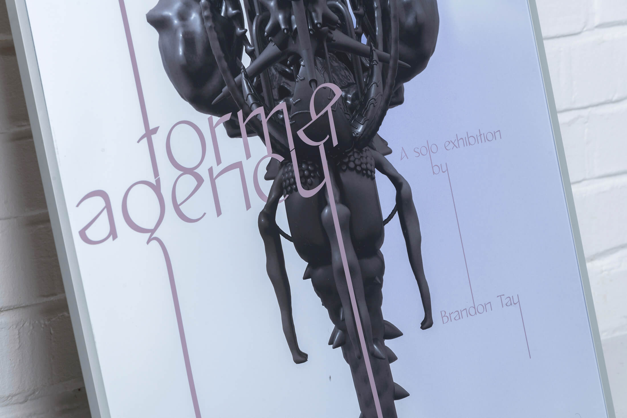
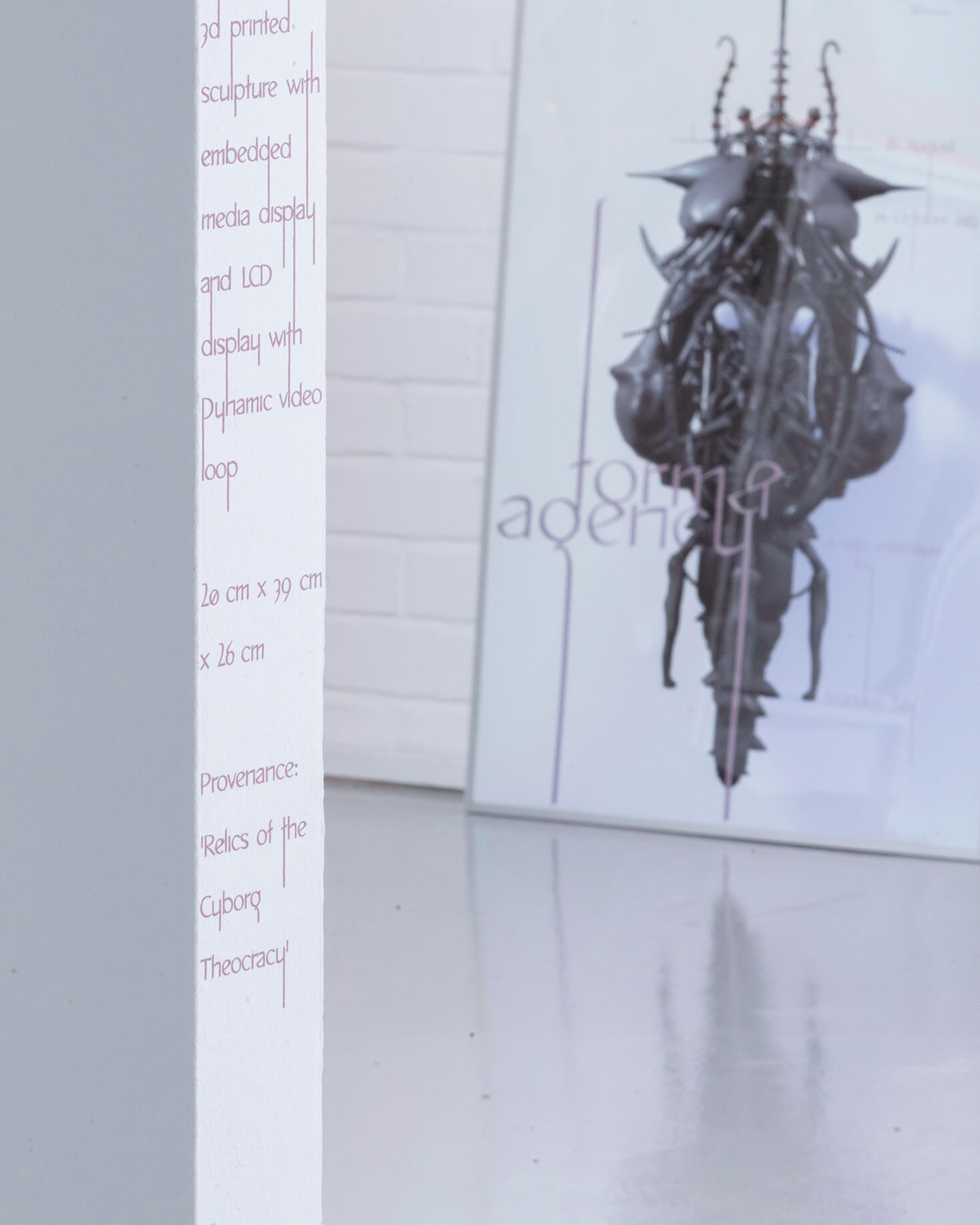
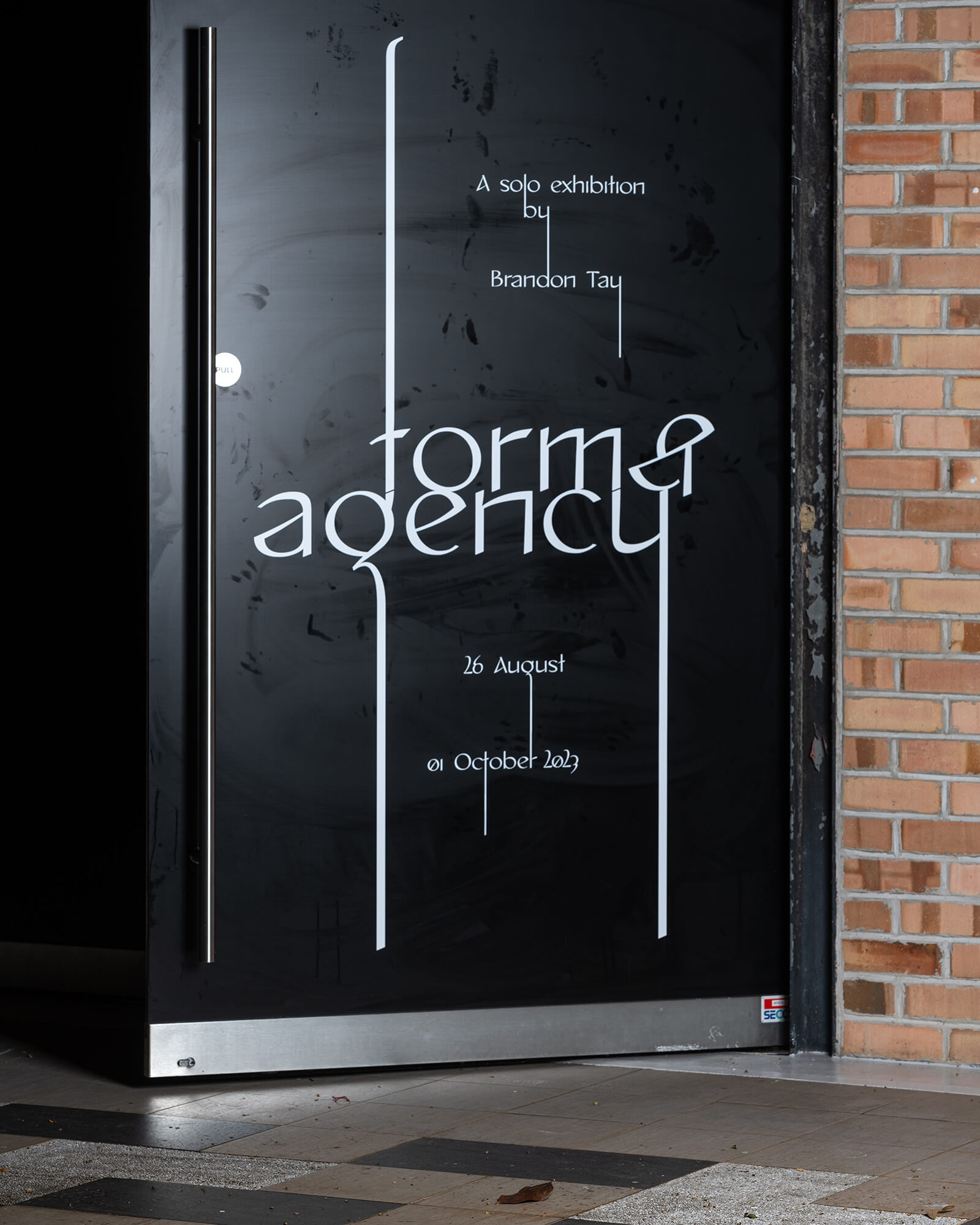
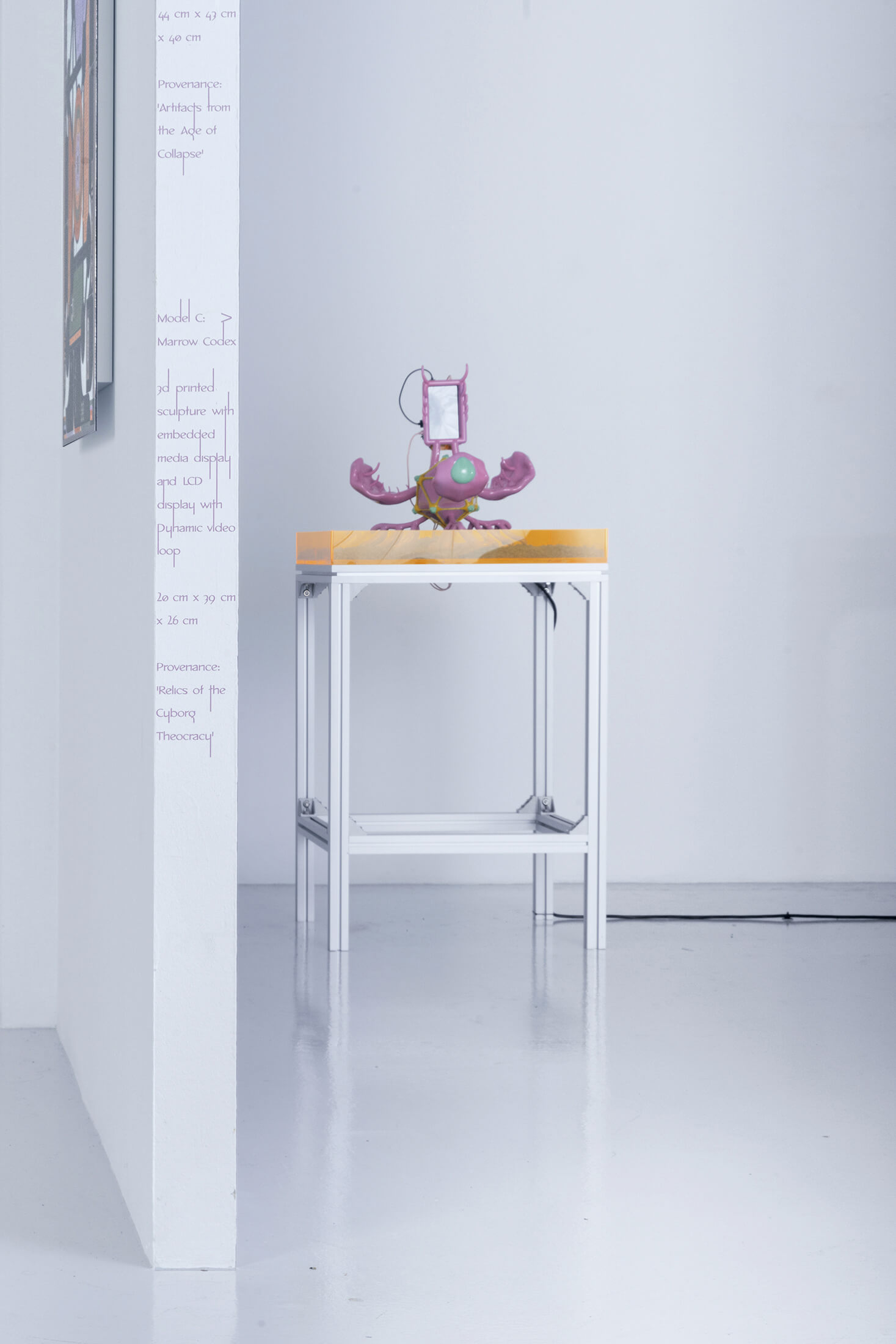
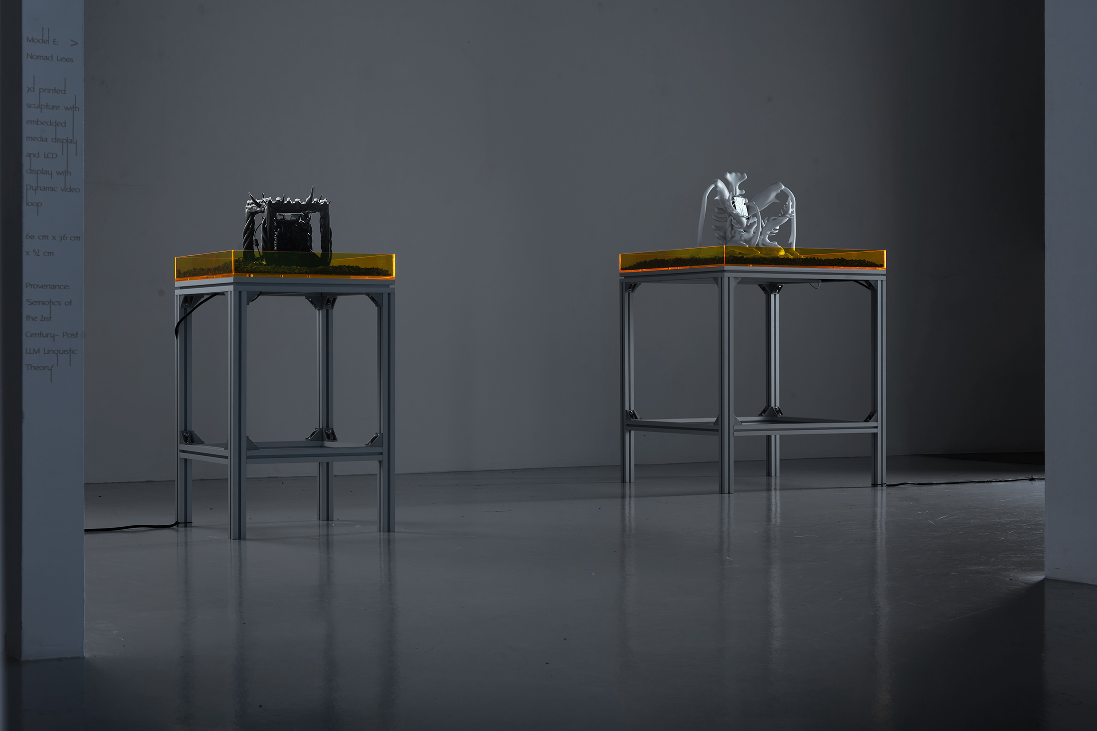
Form & Agency
is a solo exhibition by artist Brandon Tay that explores the materiality of the digital.
(Credits — Curator: Rafi Abdullah; Exhibition design: Amirul Nazree, set up w/ Nghia Phung; Website design and build: w/ Bảo Anh Bùi; Exhibition Photography: Jonathan Tan)